The illustrious tri-rhombus logo of AcquaNINJA has an intriguing lineage. AcquaNINJA has been in development since 2013, the company was federally recognized as of 2015, and as of current the logo had gone through several revisions. Below are timeline of the aesthetic changes through the years.
2013-2014
In the first designs we realized that the “A” of AcquaNINJA would be our defining trait throughout our design language, so we reflected it in our alpha/beta logos seen above at an Auto Expo.
2015
The iconic tri-rhombus design emerged in 2015 when our first projects were underway and gaining traction. It was truly a way to concrete the brand with a unique insignia.
Other animations of the 2015 design https://photos.app.goo.gl/tT3PKzTehSdc0ZyN2
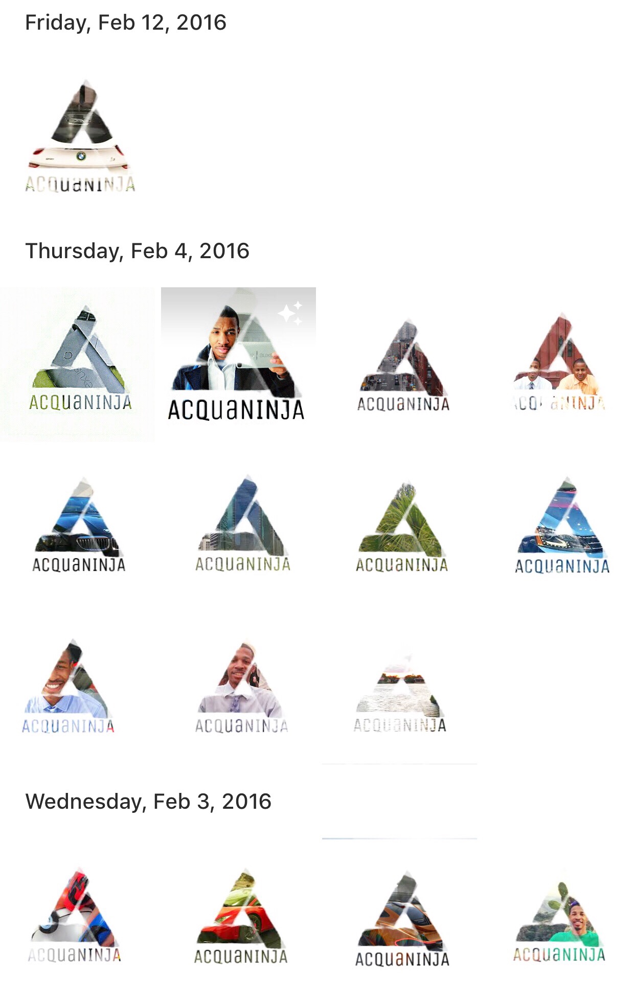
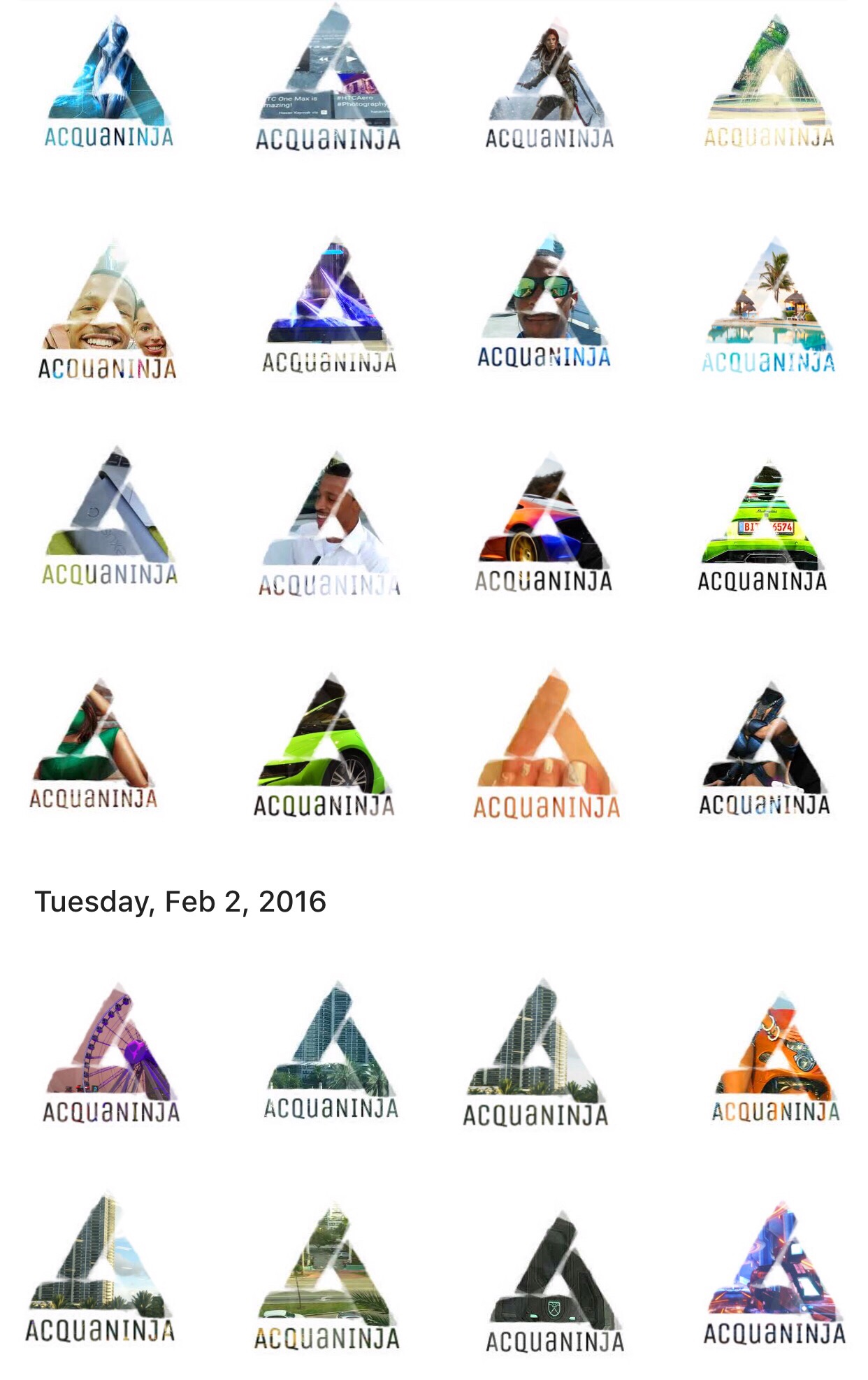
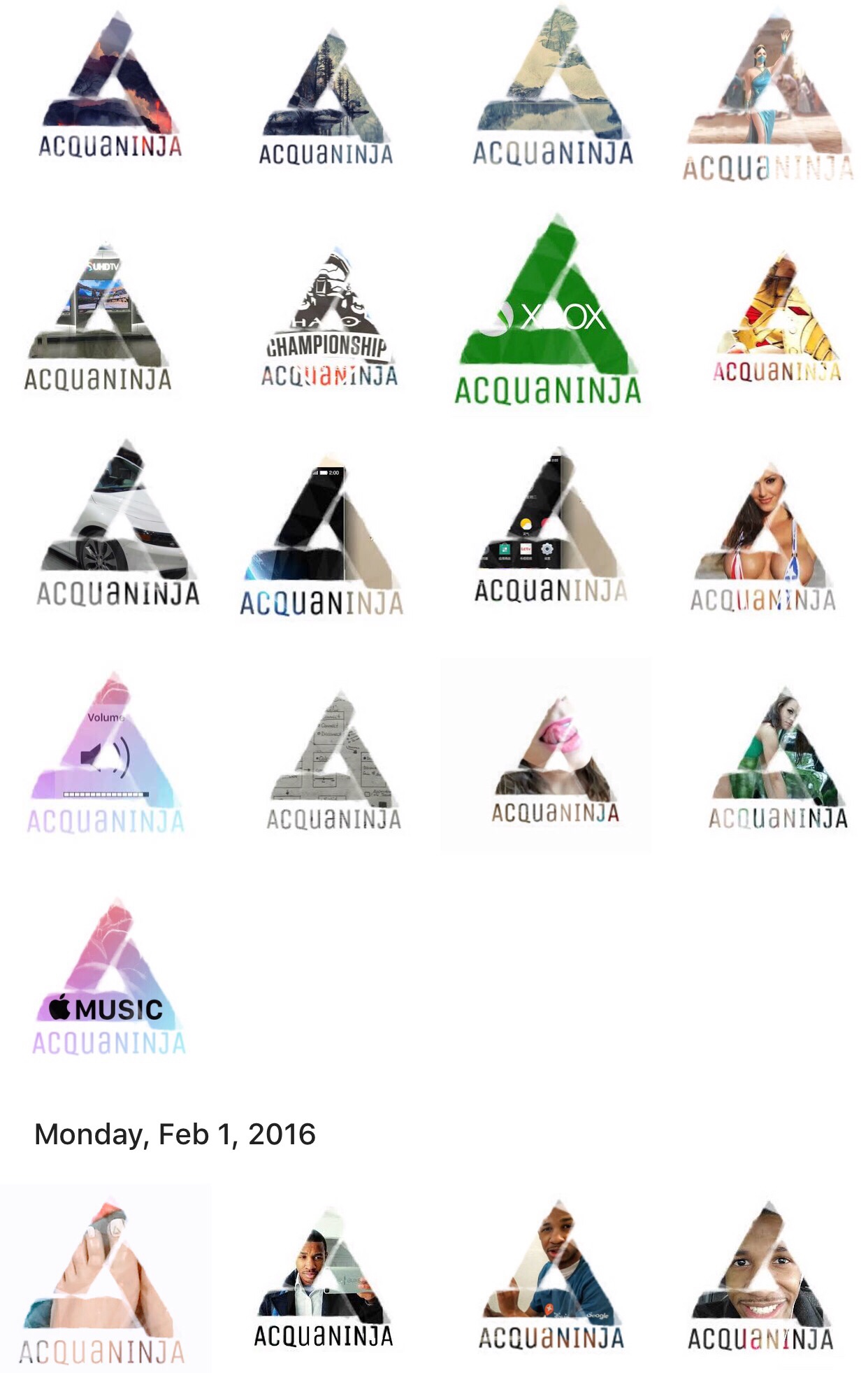
Q1 2016
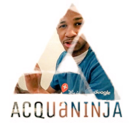
Khi Turner (CEO of AcquaNINJA) pictured above wearing Google Maps shirt. This is the dawn of incorporating images and artwork within our logo. We now had the technology and expertise to include any media inside of the logo this was a huge breakthrough. Below are some examples of different designs we integrated into our logo.
Q2 2016
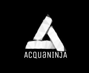
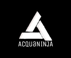
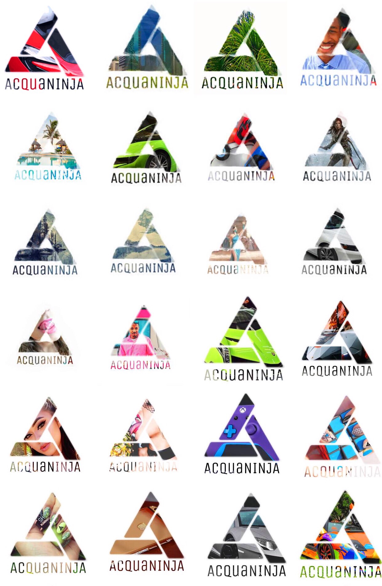
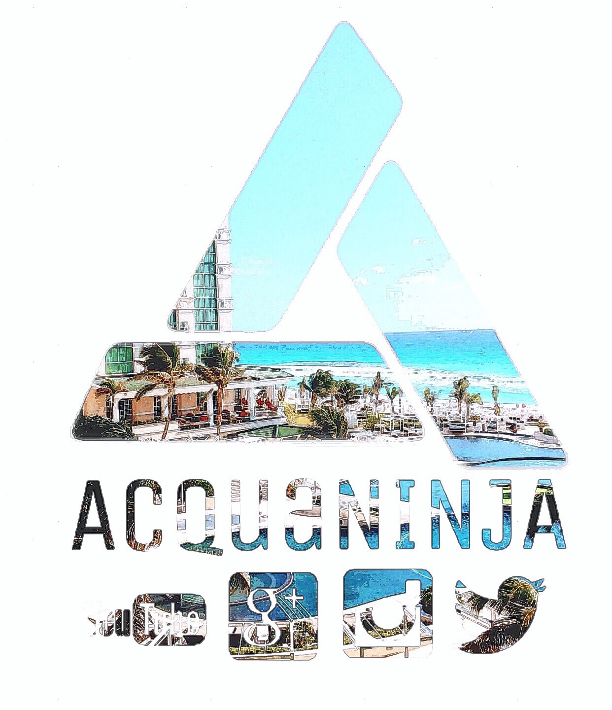
In the Summer of 2016 we wanted to refine the logo and ‘clean up’ the rough edges as it gave a more presentable appearance and was more aesthetic.
![]()
![]()
This was the baseline design thought behind how we wanted it to look. First the raw logo (tri-rhombus) cleaned and refined, then our name. First we wanted it small, yet from a distant and in icons it was practically invisible thus we tried the off-centered approach with the third design. It worked, yet it still was slightly smaller than desired, so we finished with the design below.
In these the name spanned the entire bottom of the logo giving it a very bold and characteristically stable look such as Nike.
We revamped the colour scheme so it could adapt to different backgrounds and fit into almost any environment like a chameleon you can see how in the animations revisions.
![]()
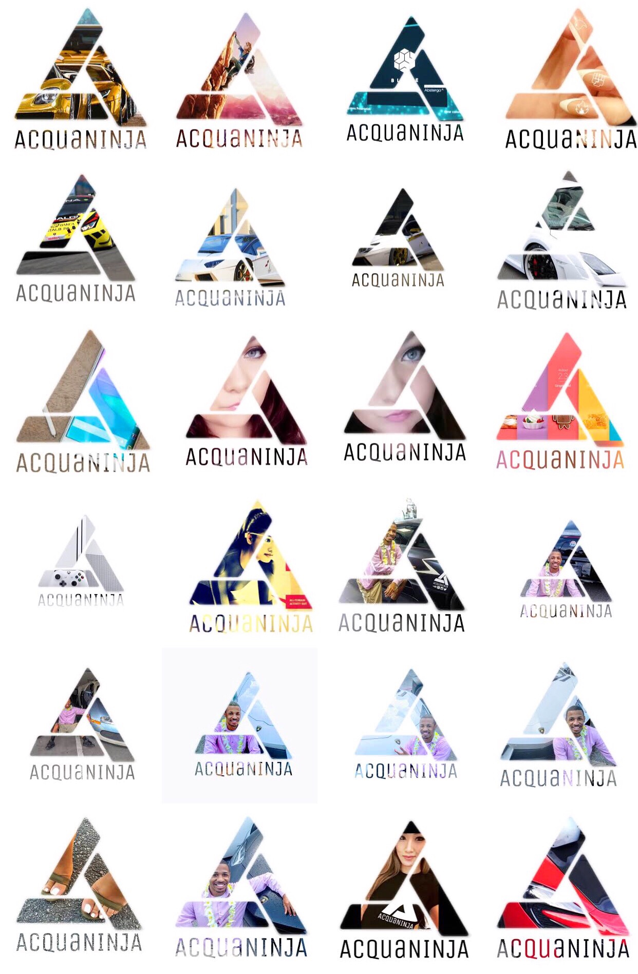
These are the high contrast versions of the design of Summer 2016 which is why the resolution is so high and they appear so HD. This would proceed to becoming the standard in our designs. Below are several examples of our logo in practical settings.
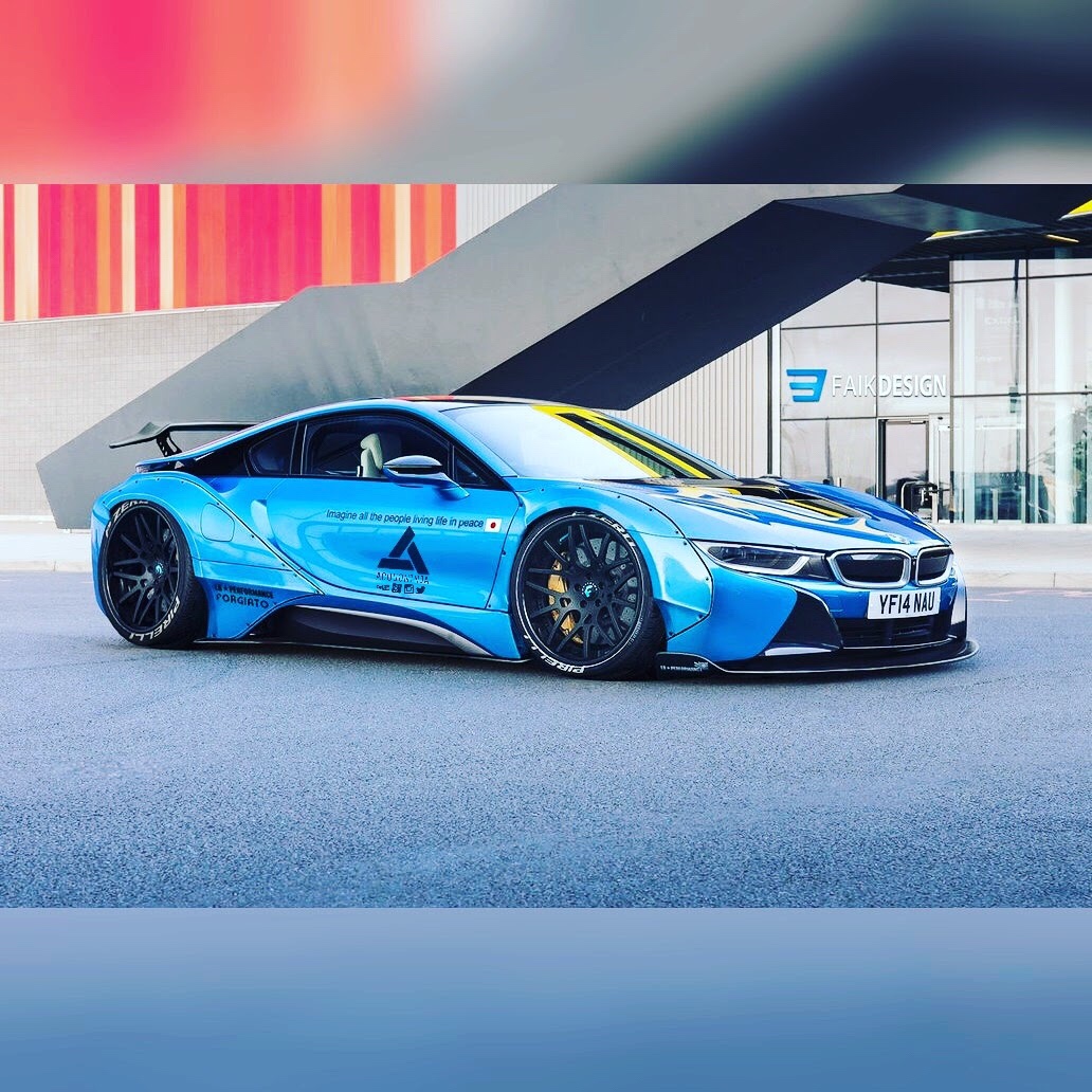
The BMW i8 with the AcquaNINJA badging on the side door panel (shown above) and Abstergo logos (shown below).
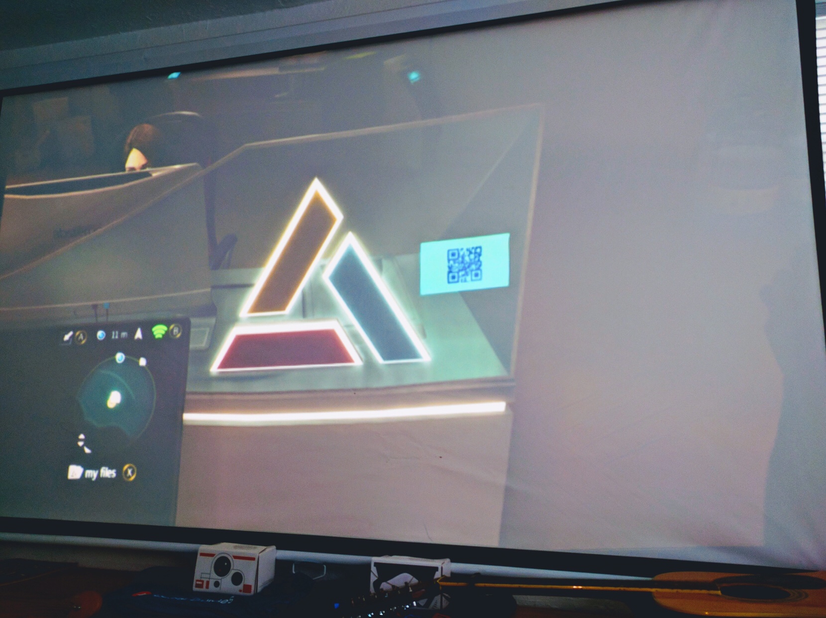
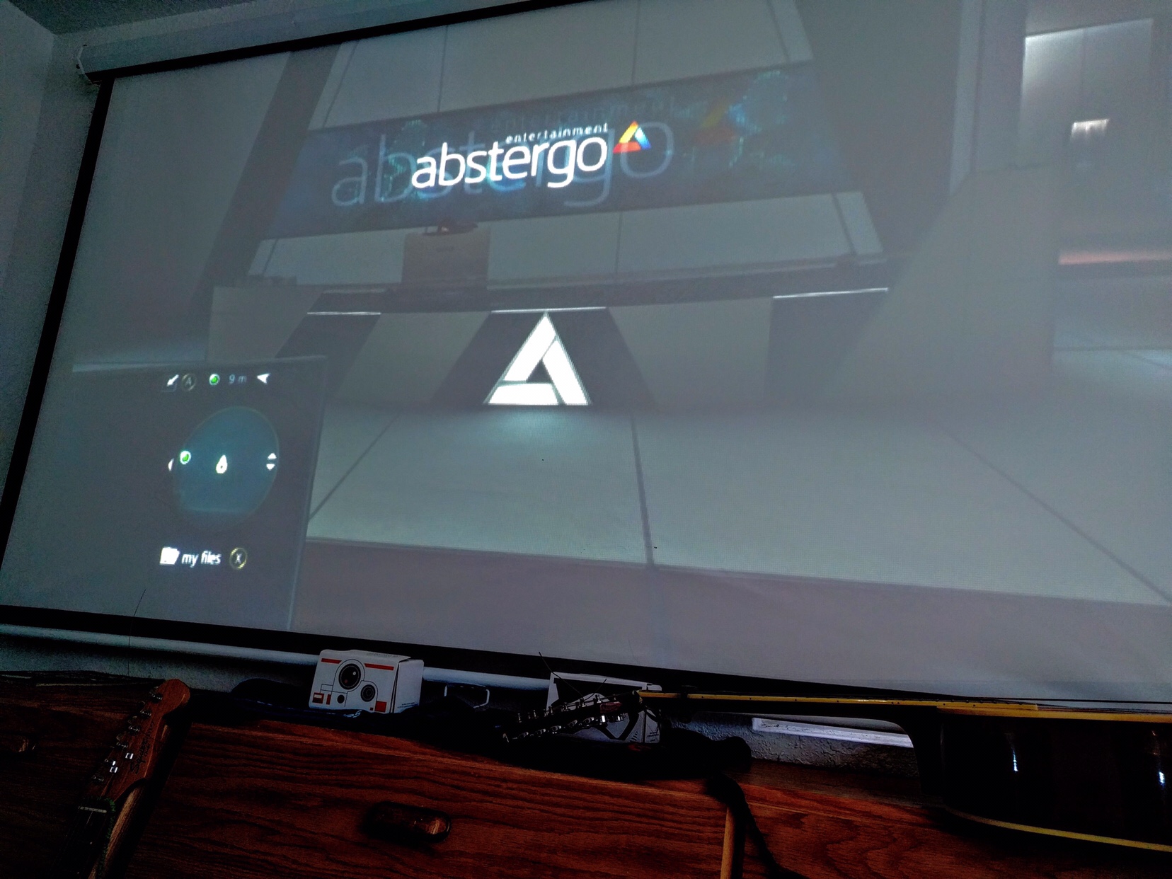
The Abstergo symbol from the acclaimed Assassin’s Creed sporting a similar tri-rhombus design, in a game that warns against the dangers of future technology. How ironic?
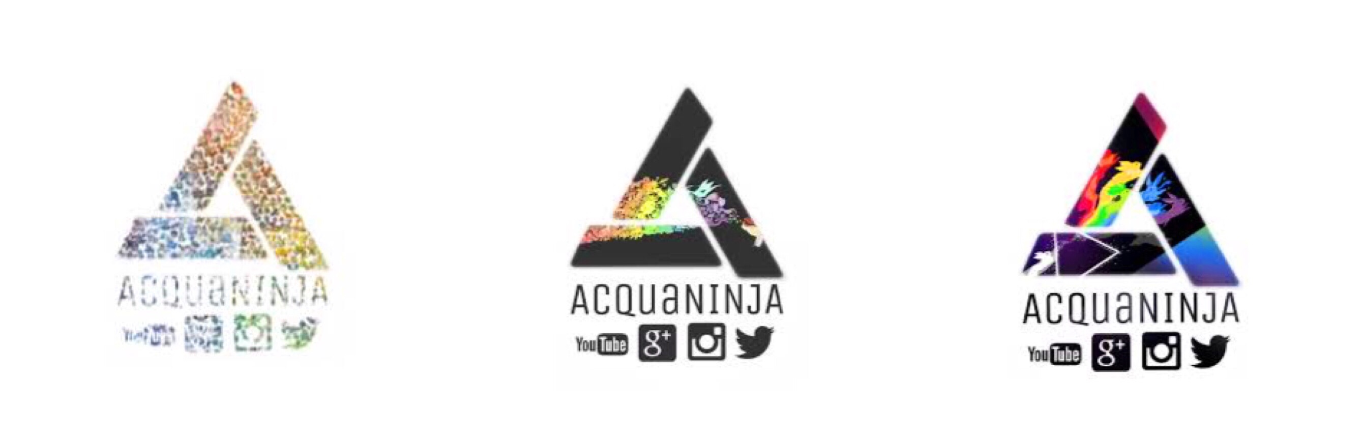
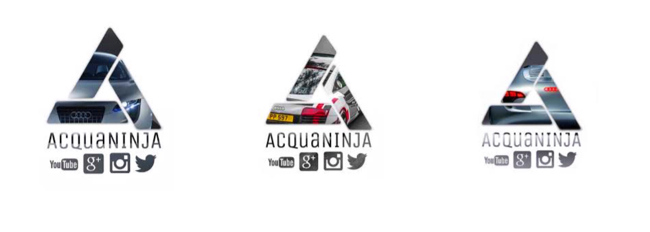
June 2016
![]()
We upped the resolution to 4K and it was ever so slightly cleaner in design as well as stabilizing our brand with the insignia. Below are more illustrations of designs adapted with the new logo.
Animations of the AcquaNINJA logo during this period
Q4 2016
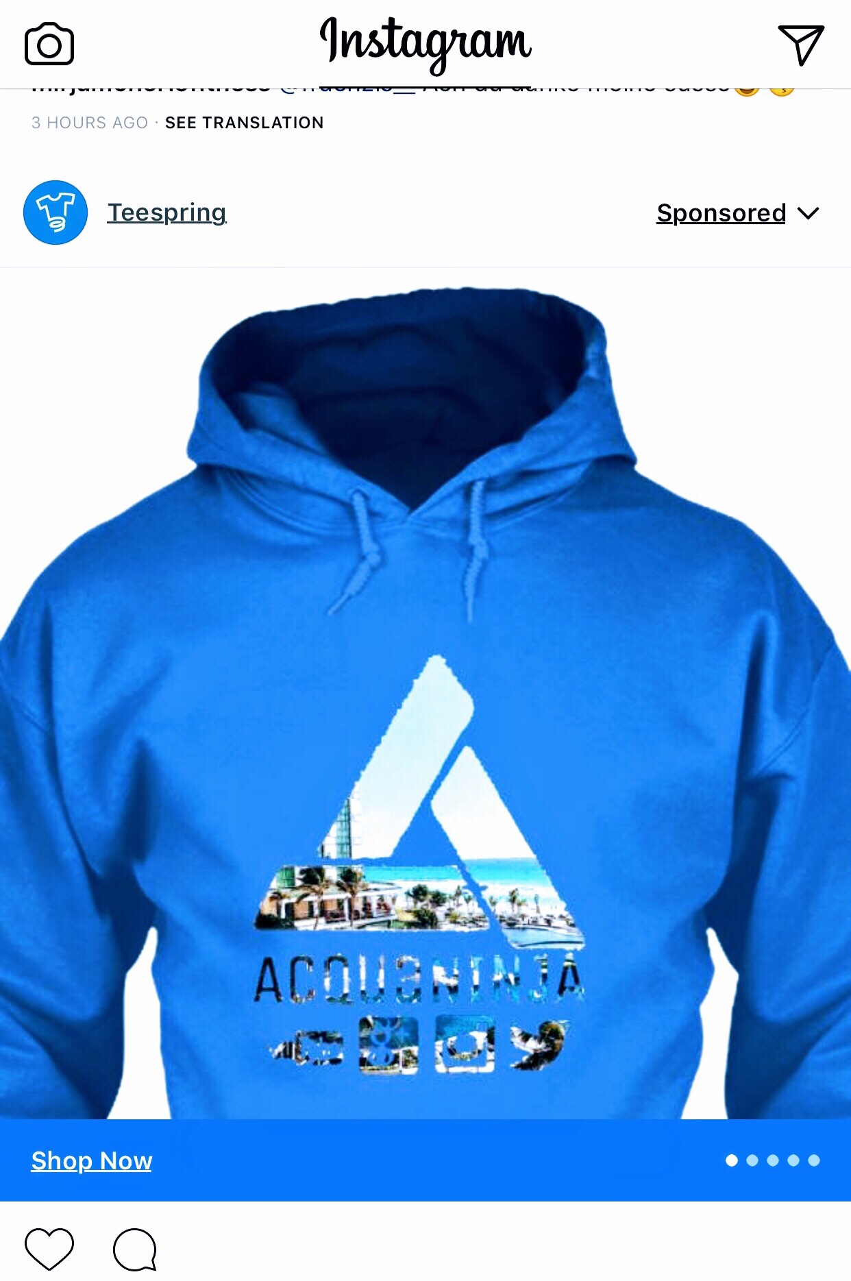
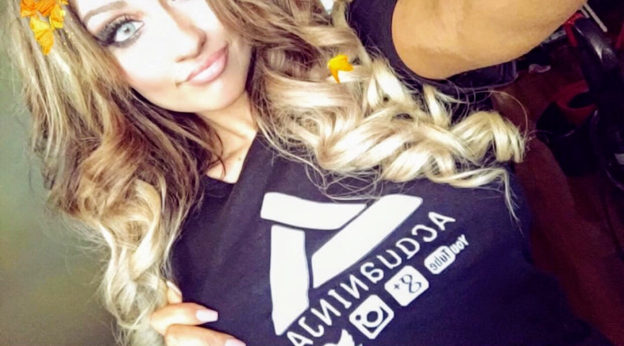
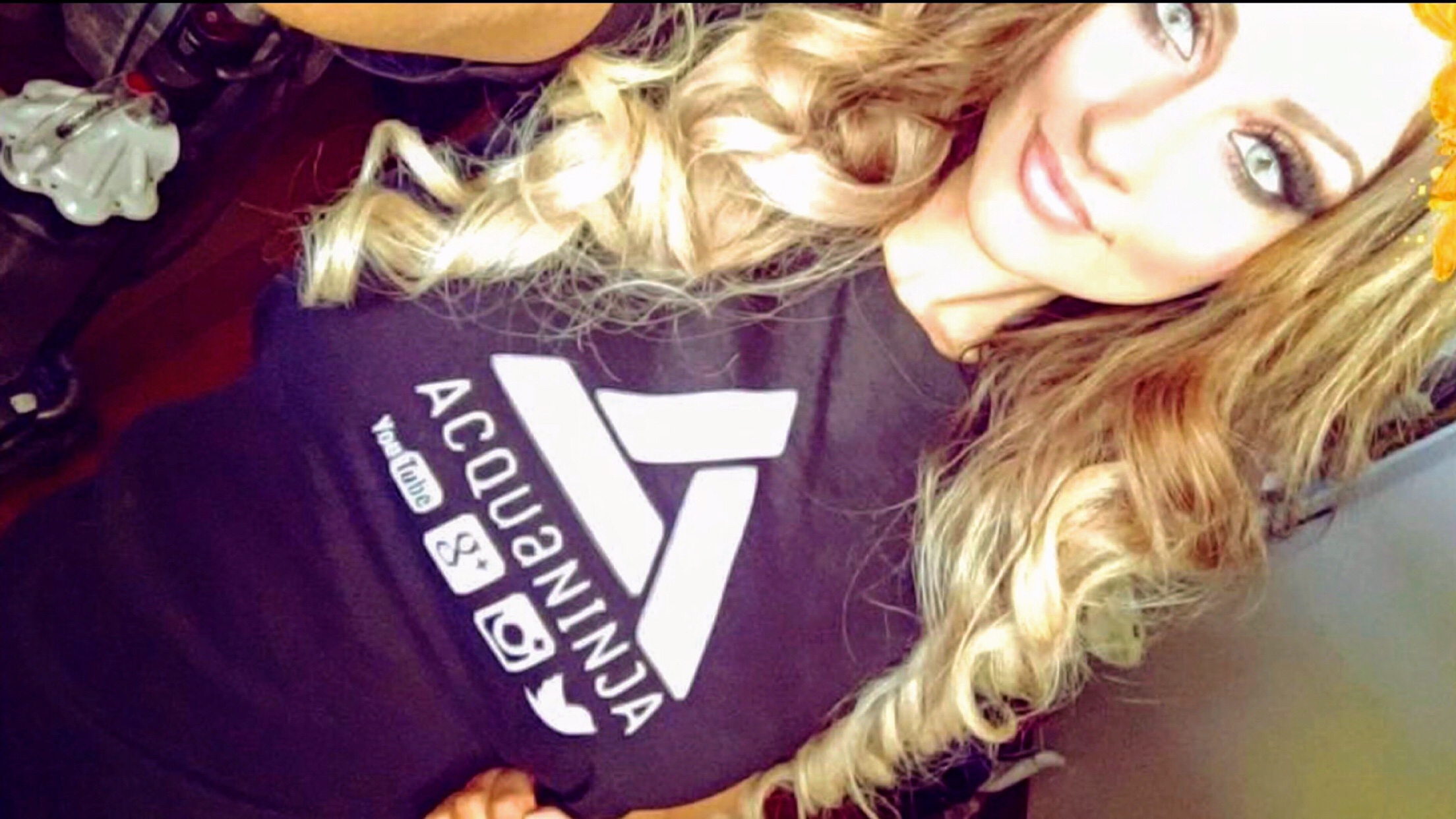
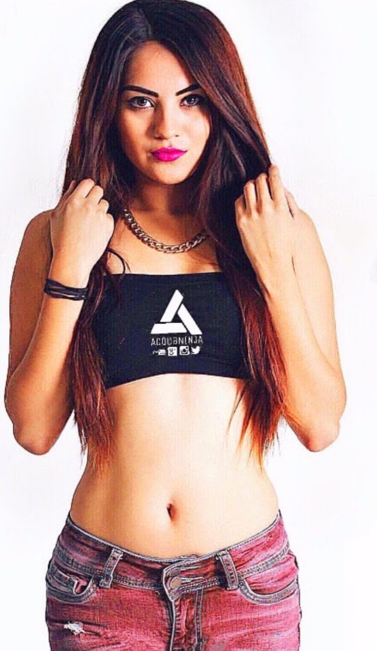
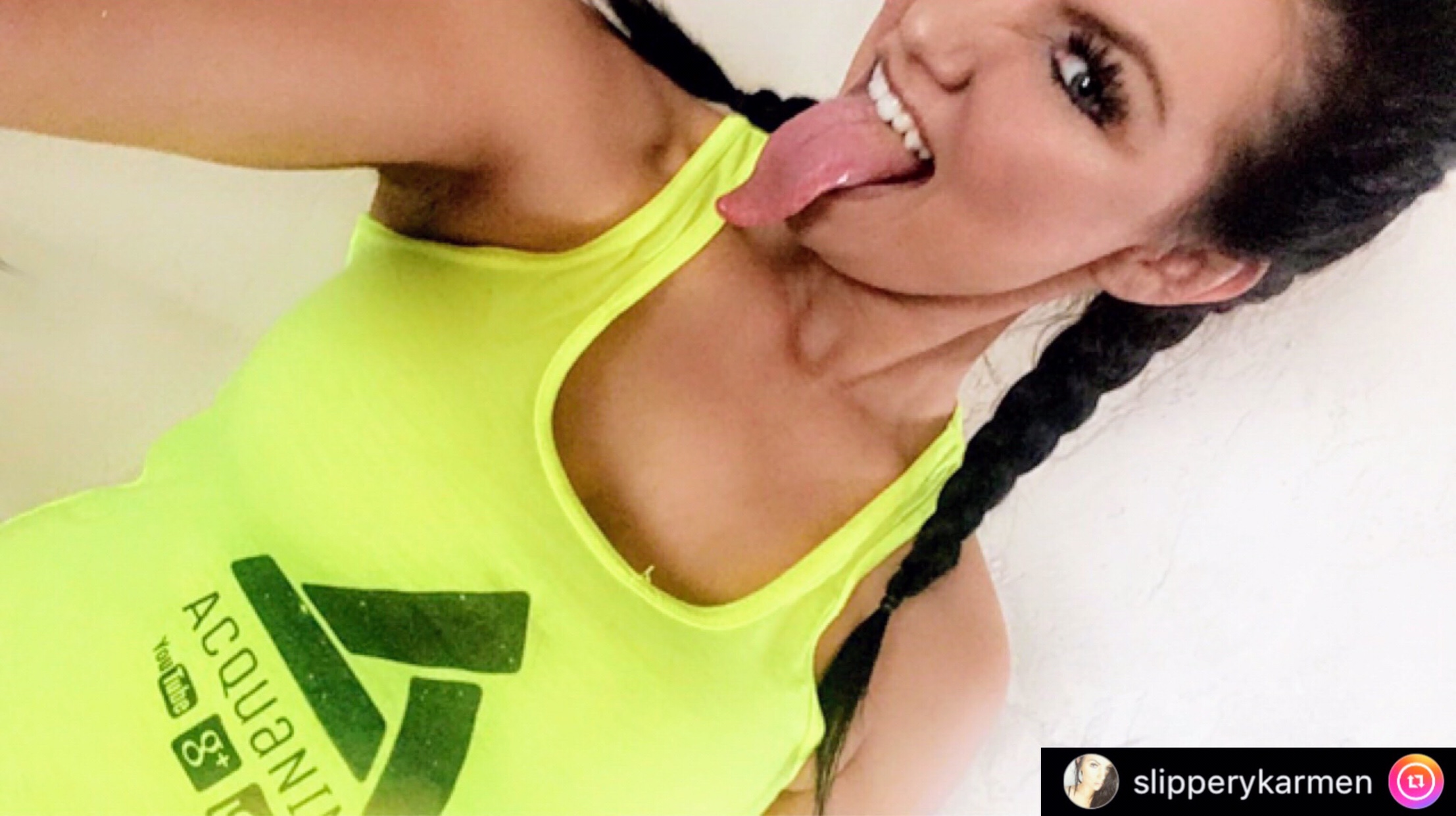
In the later months of 2016 we started using our custom brand designs in our first shirt artworks. Below are a few of the limited edition designs that were released sporadically.
Alongside those designs we released the beach design below and the fan love for this design was amazing. We decided to keep it as a permanent apparel item.
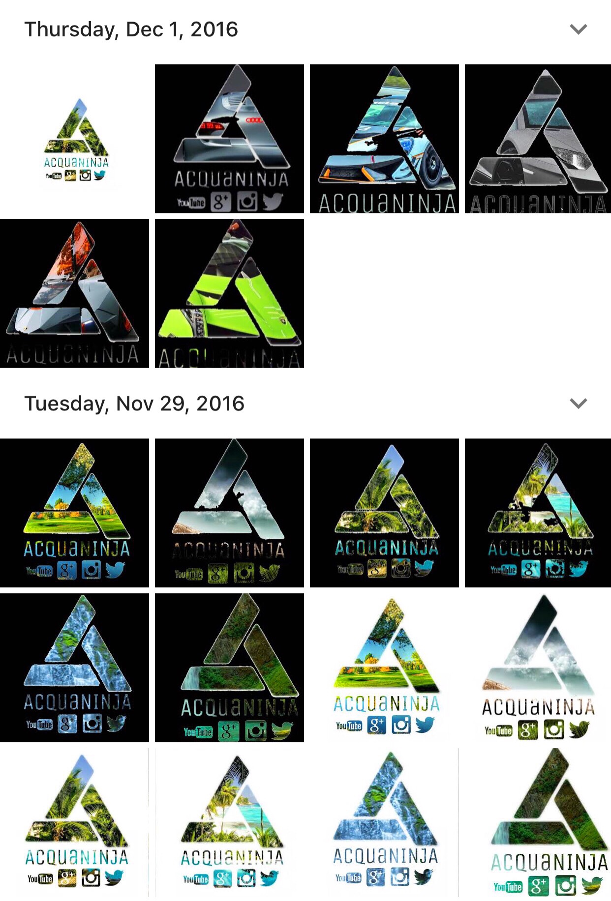
We seen our designs everyone in the upcoming weeks such as Google Ads, Instagram, and people have even reported seeing them on certain websites as banners.
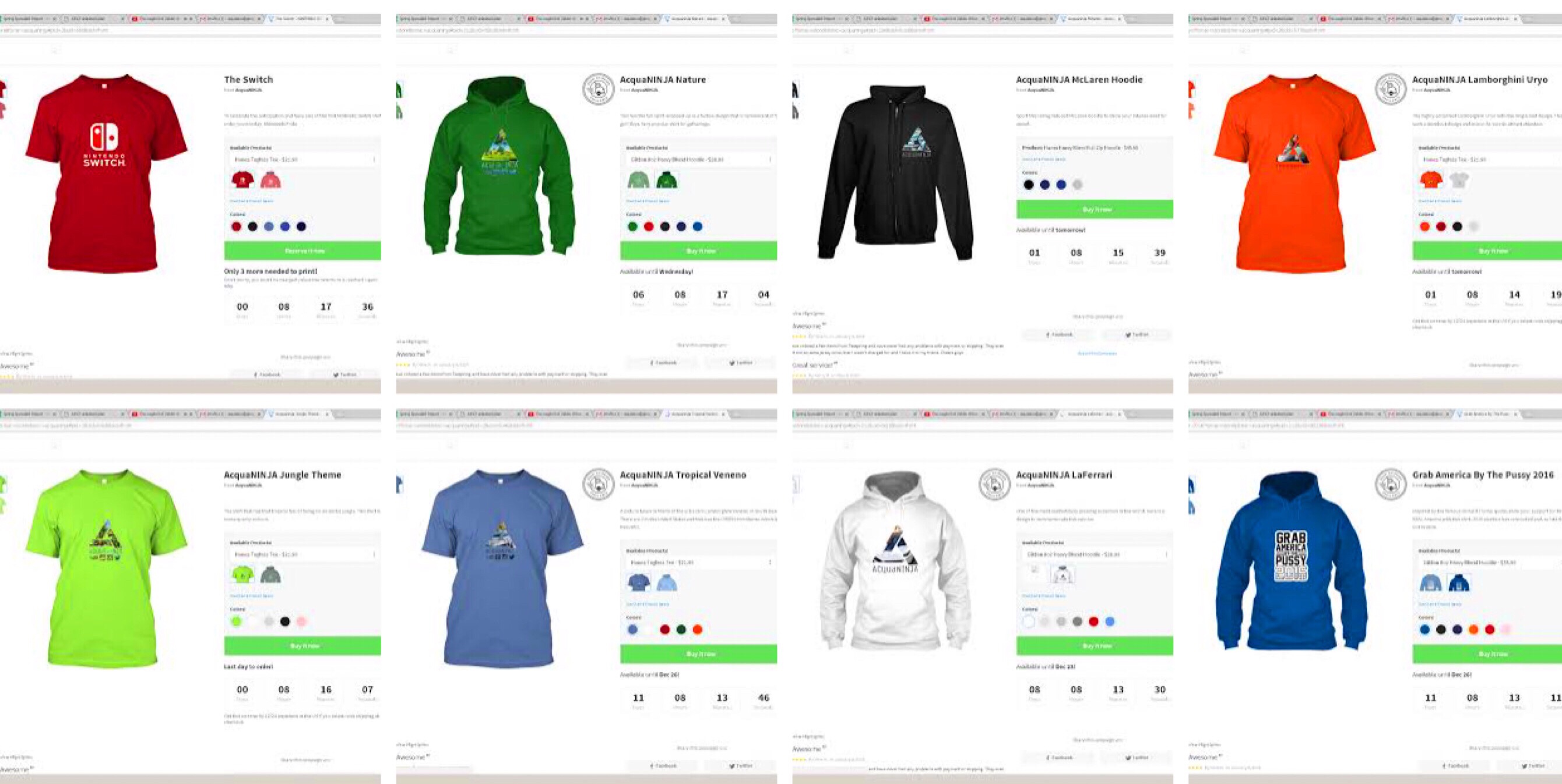
Along with the advertisement we had so many designs that it was difficult deciding which to release for the website. Here are some of the designs from that season.
Our website was a buzz this is how it looked initially, there were more and more designs being added daily.
We acquired a few models to help promote our brand. We expanded to more and more people wearing our brand and loving the logos and how we incorporated it in unique designs.
Q2 2017
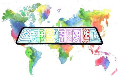
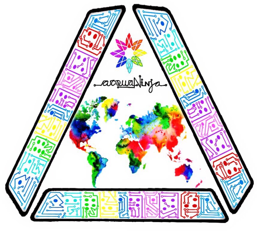
In the second quarter of 2017 we embarked on making our branding more internationally friendly and gaining more worldwide appeal.
Q3 2017
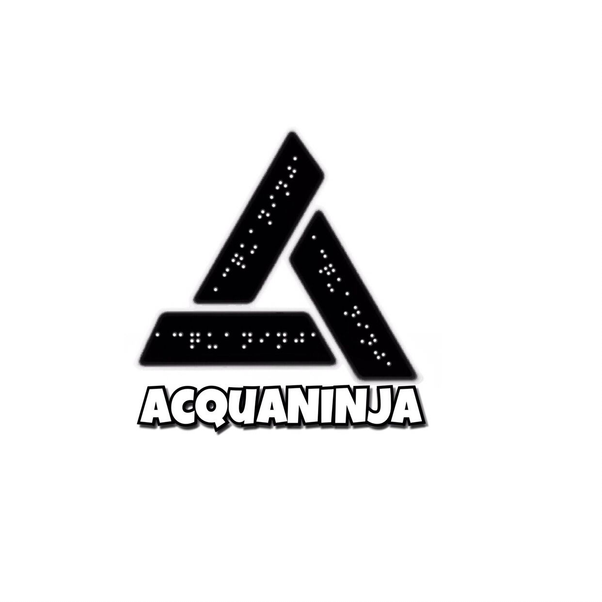
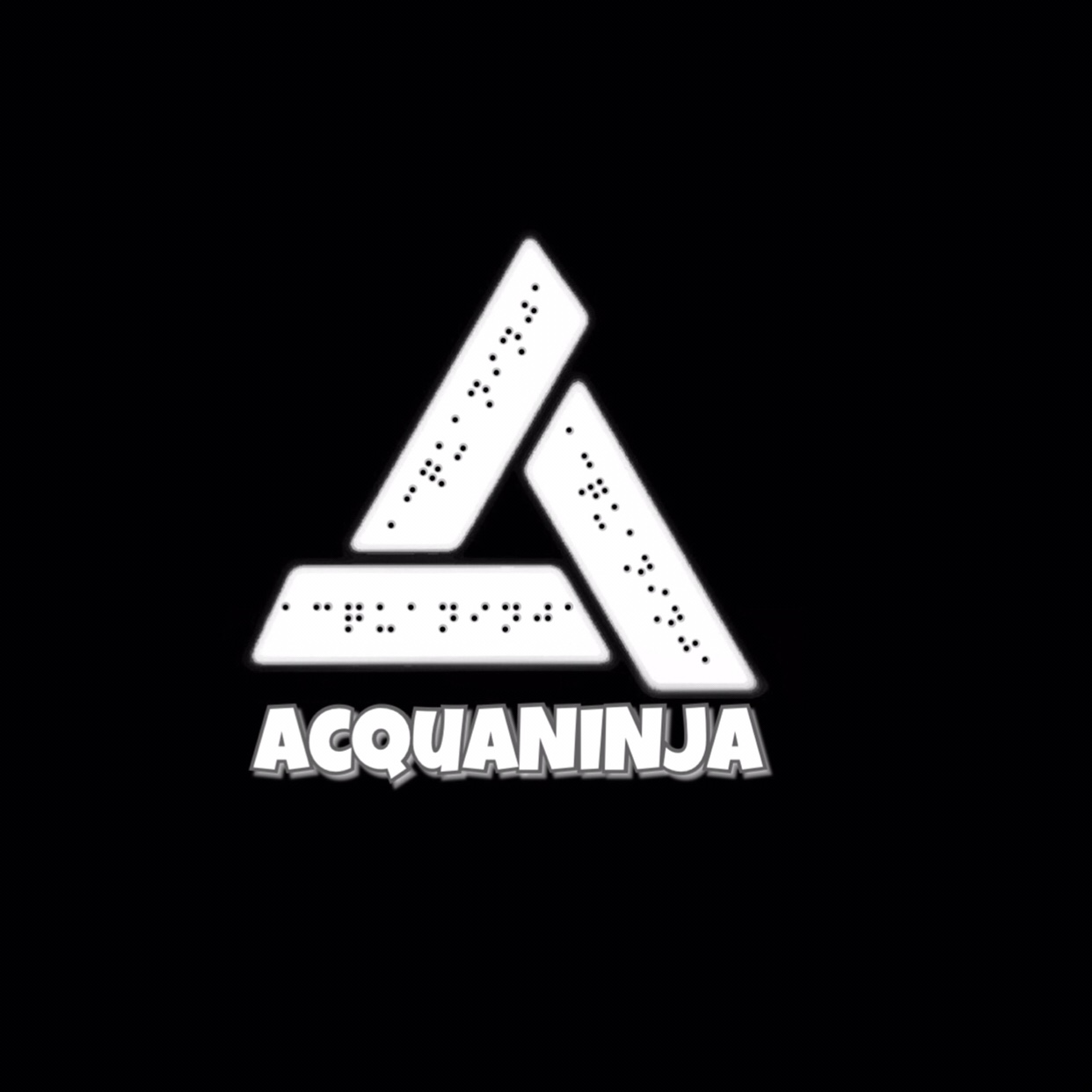
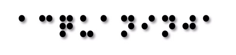
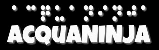
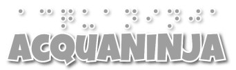
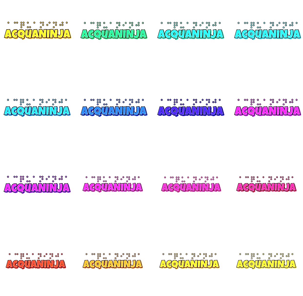
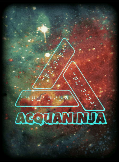
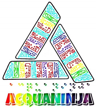
In the Fall of 2017 we added the braille dots to our logo that gave the logo that unique flare that we were seeking for so long.
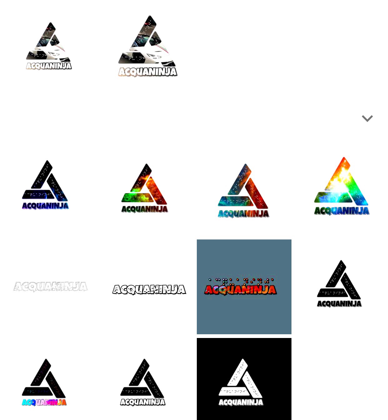
Along with the base logos shown above we have the custom logos like every other revision which are shown below.
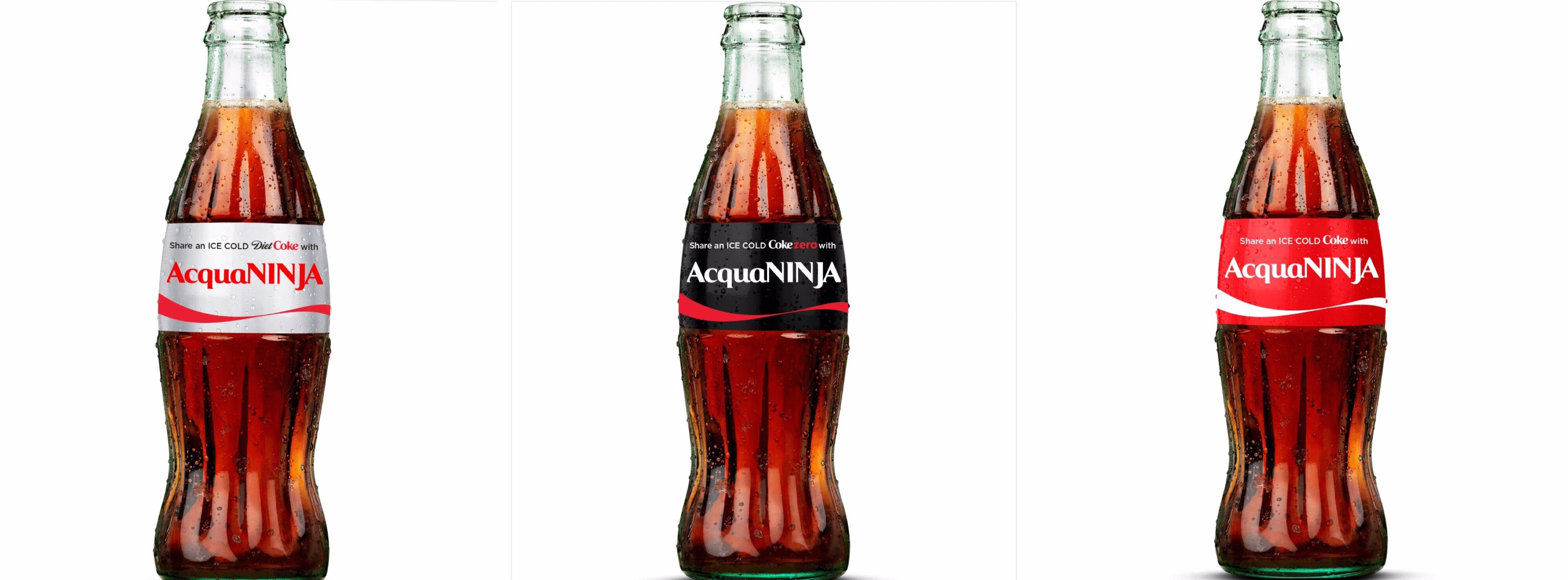
We designed our custom Coke bottles after being awarded one of the best Tech companies in Hialeah and a Coke bottle collector actually purchased to add it to his collection.
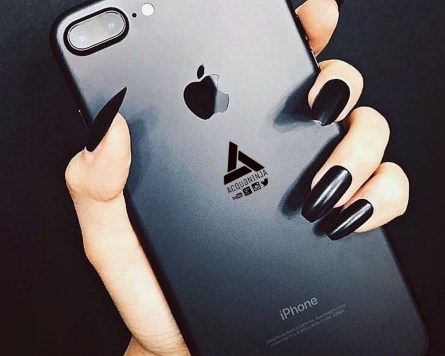
Upon request for pop sockets and phone cases we released a few designs of phone accessories for the brand. One of the popular skins is shown below on the matte black iPhone 7 Plus.
This is the braille in our logo which literally translates to “AcquaNINJA”, though it isn’t textured it provides a streamlined effect
With some of our apparel the full logo maybe cumbersome, so like Adidas we wanted logos to reflect the occasion, thus the name and dots design fit the bill
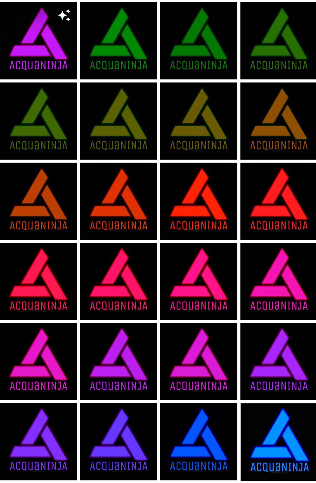
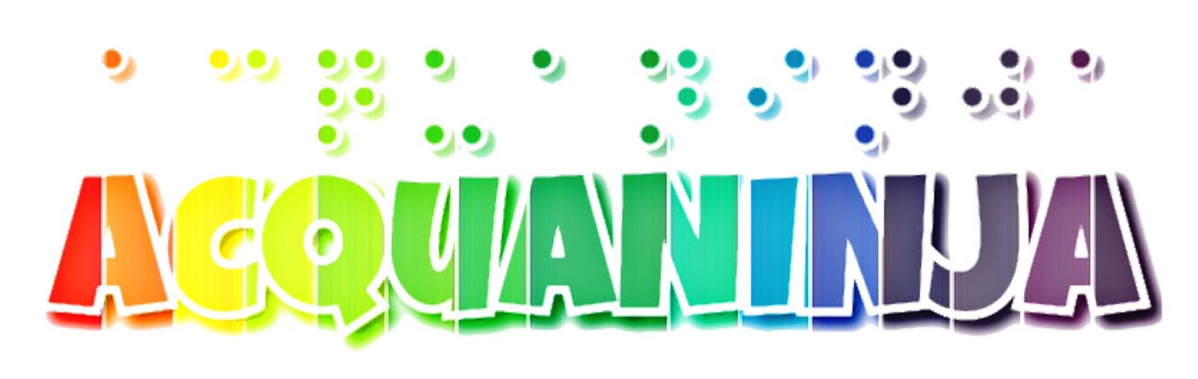
For the AcquaSCALE we went with a more rainbow-esque design since it had to convey positives, negatives, and everything in between.
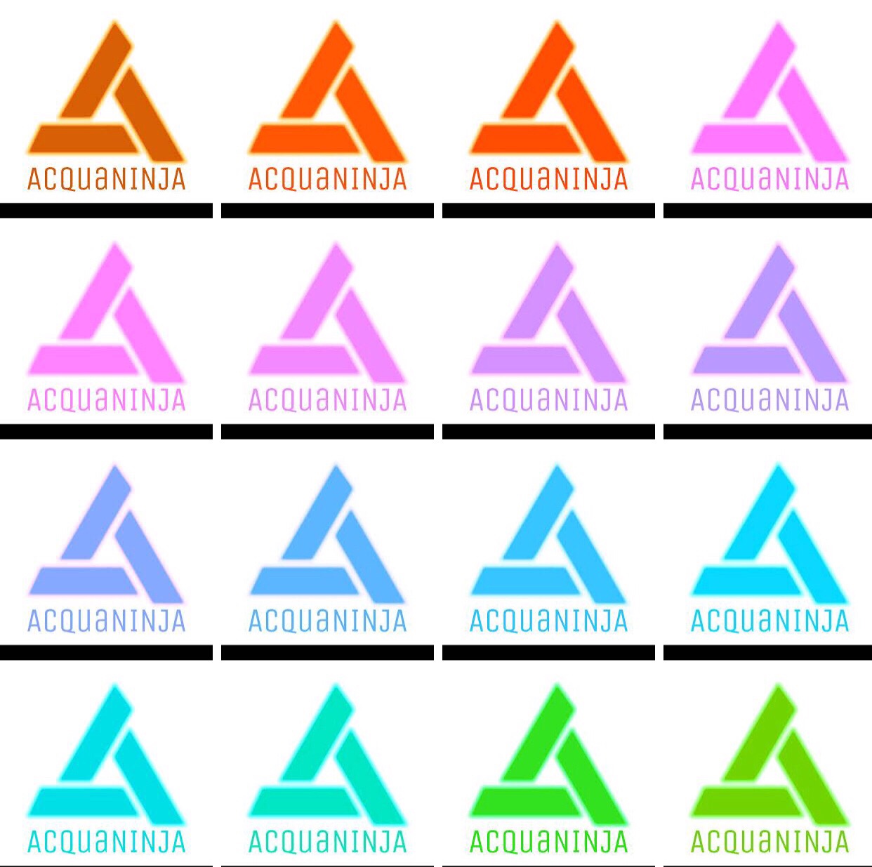
For separate applications we also made the entire solid colour array which can be seen below.
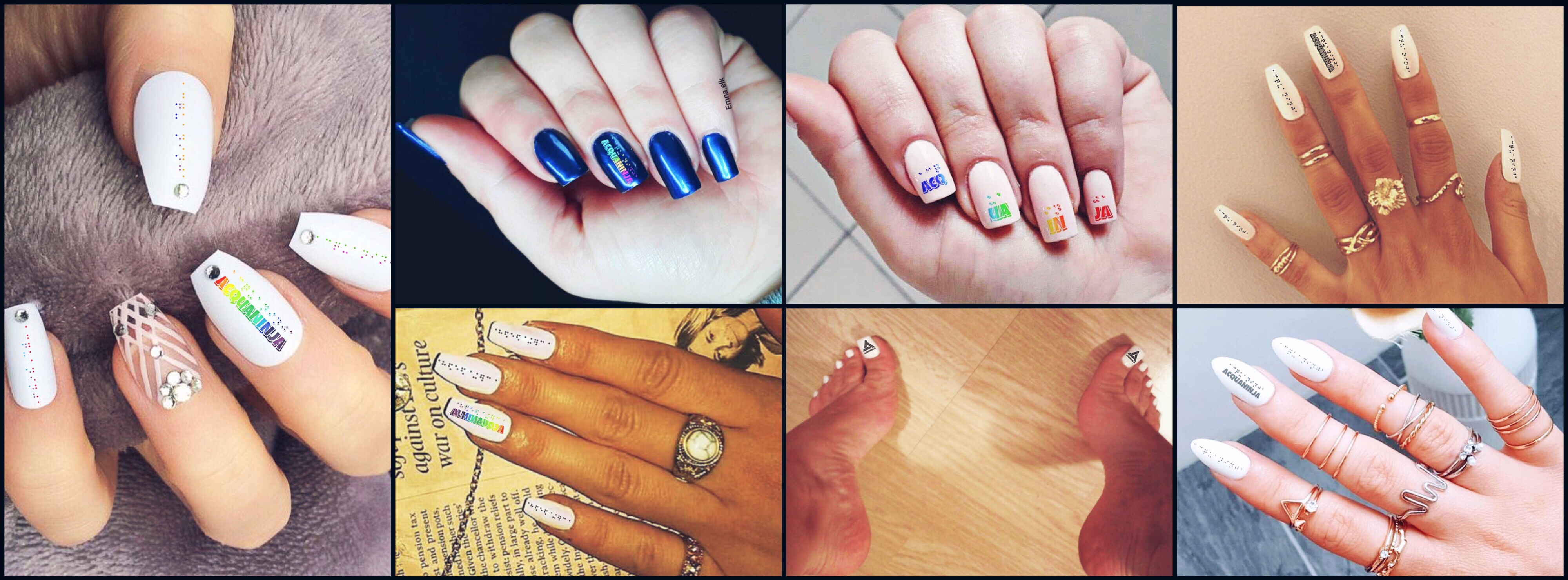
One of our upcoming projects: Project Neiru which focuses on developing sedatives in drinks to protect women from substances. These are some custom nail stickers that are a current prototype of the design.
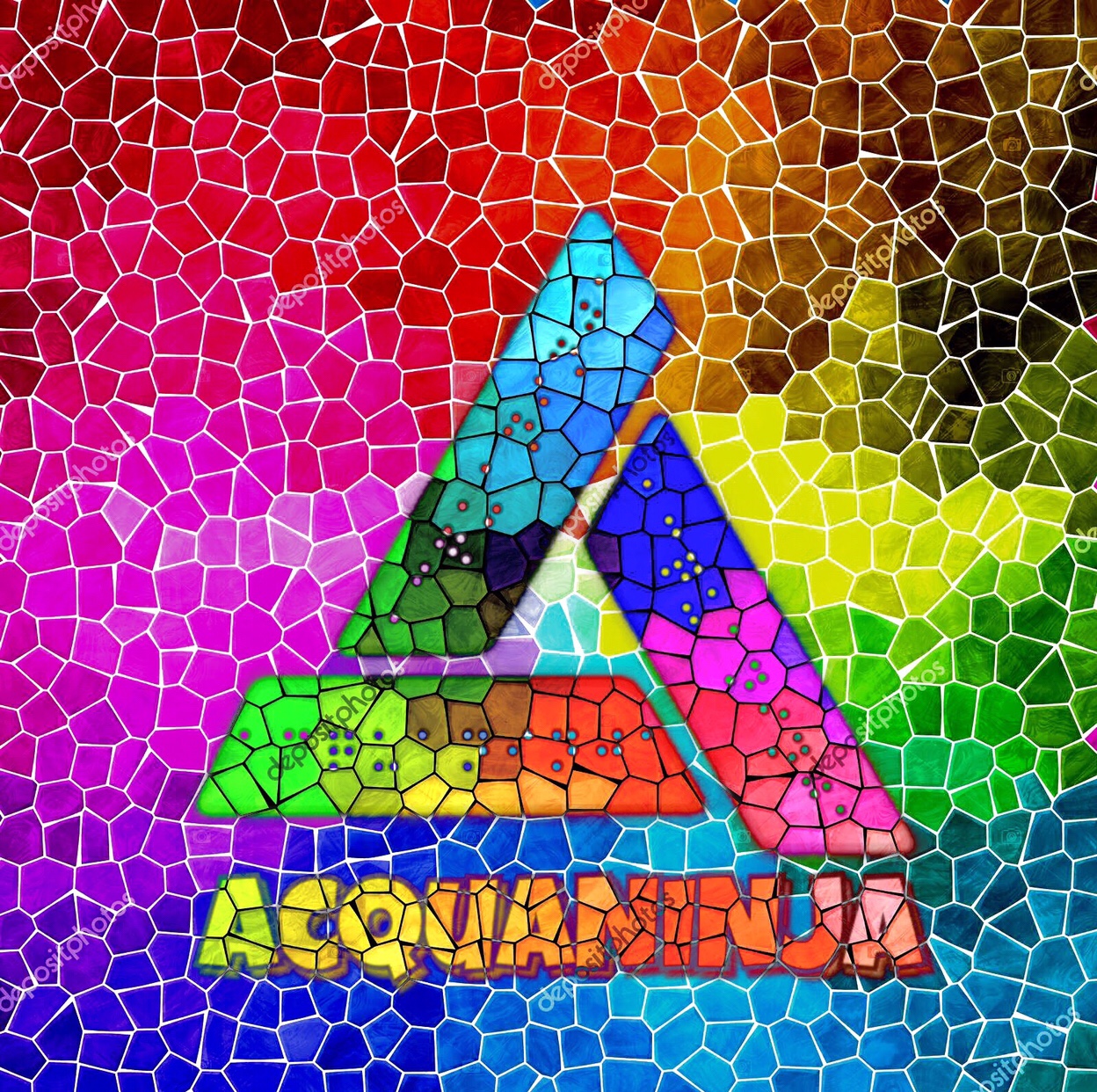
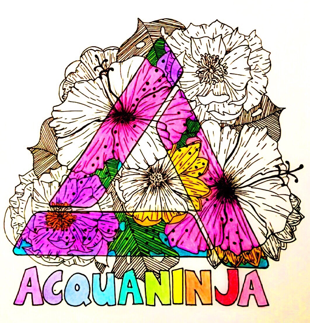
We had a few special occasion designs that were represented the brand in unique was such as the floral and mosiac patterns that were limited edition (shown below).
Several artists have composed works of the same era such as KrisCCG (shown below).
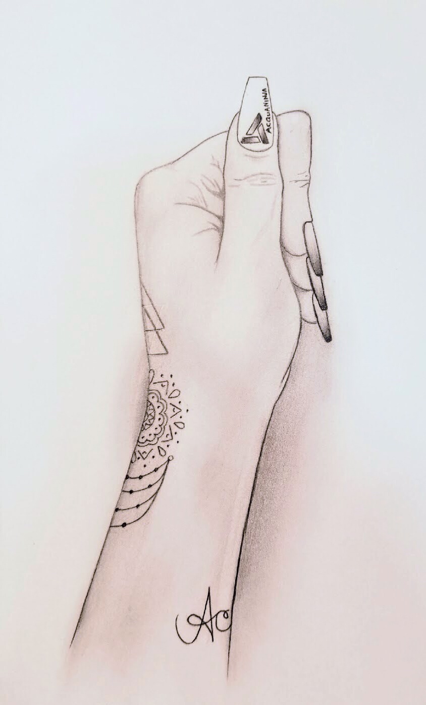
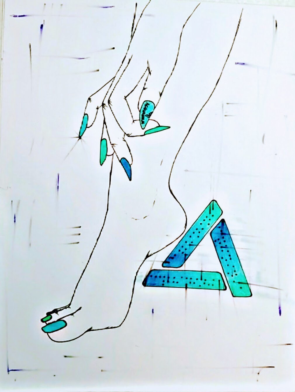
The hands above are from KrisCCG as well and it shows the logo in animation form as well as using hands as the medium which is rather creative.
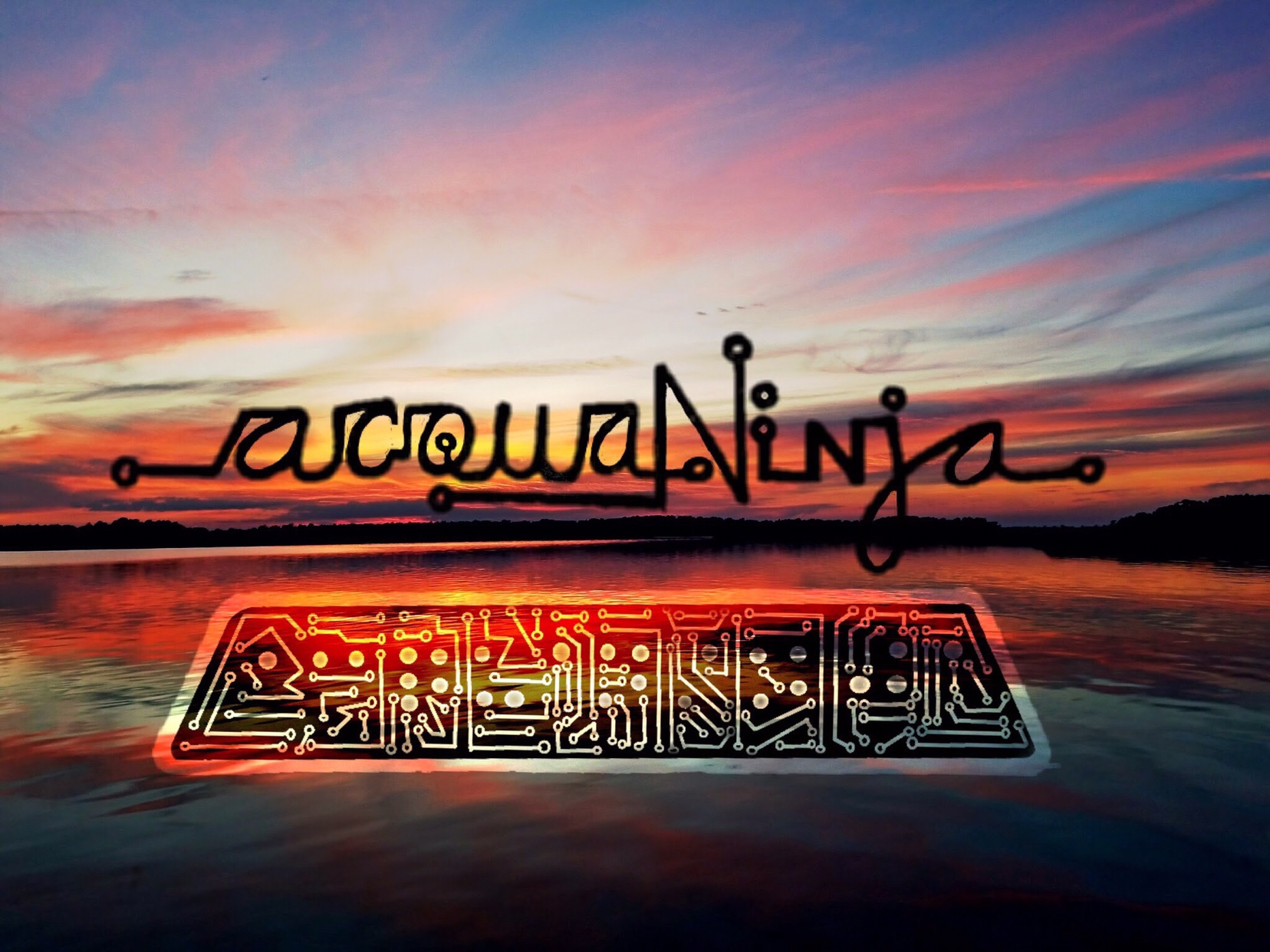
Q4 2017
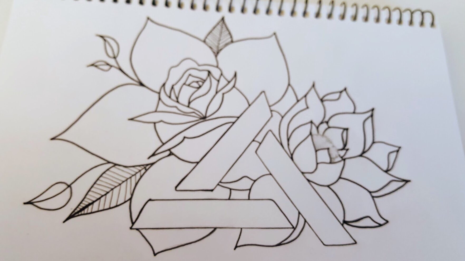
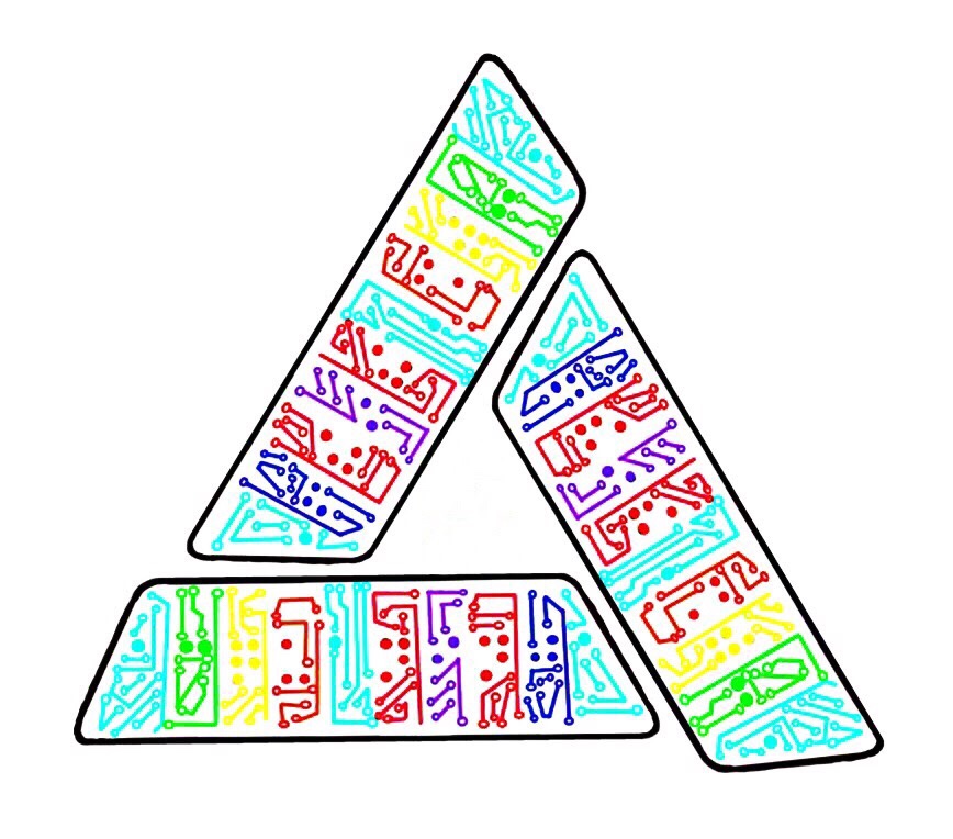
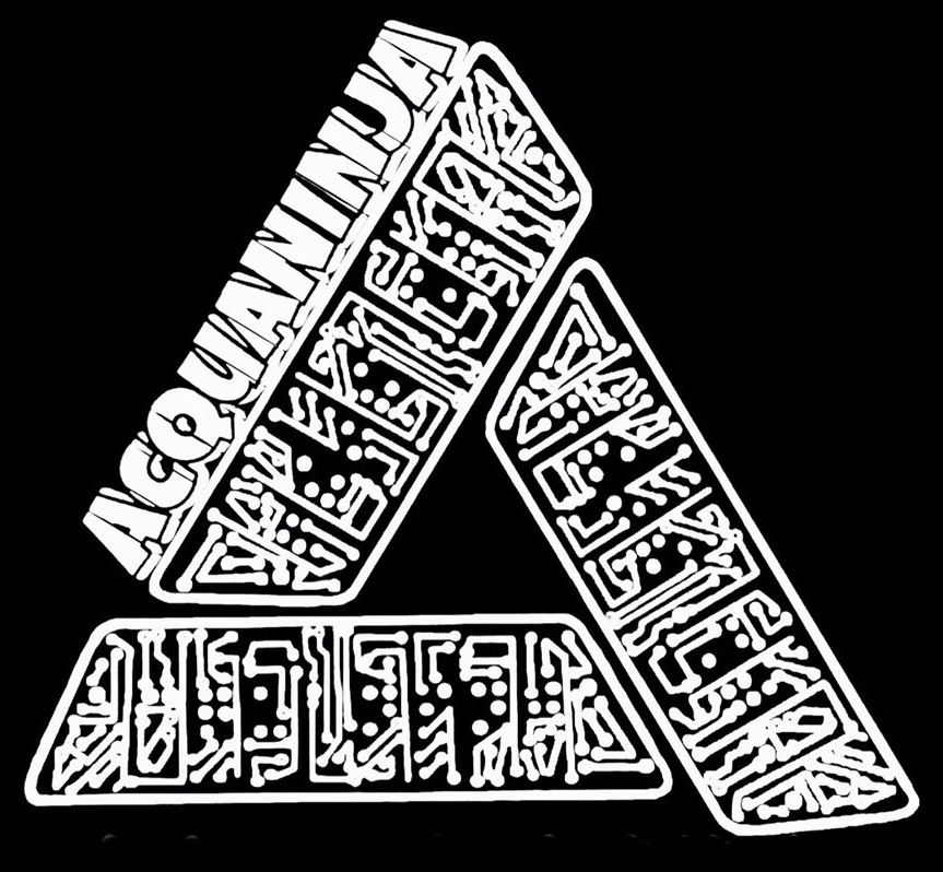
There comes a time when every logo has that major altering point and for ours this was the revision that truly made it what it would currently be known as. Below are some designs from the uber creative KrisCCG.
This design language (shown below) truly shaped the brand with the circuitry given our tech-based nature it seemed super fitting.
We inverted the tri-rhombus design for the next two designs, and it did not fit the look we were going for, so we switched back still using the circuitry and it was downright 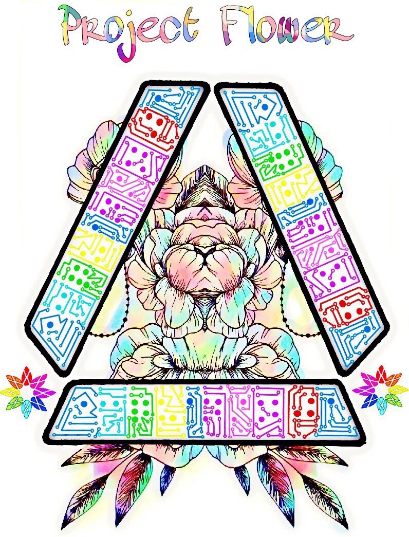 perfect!
The logo is its glory and the special edition Project Flower version of our logo.

There was an ad on Google for our main design which was pretty amazing to say the least.
The allure and buzz of AcquaNINJA was just starting to gain recognition with the mainstream.

Q1 2018
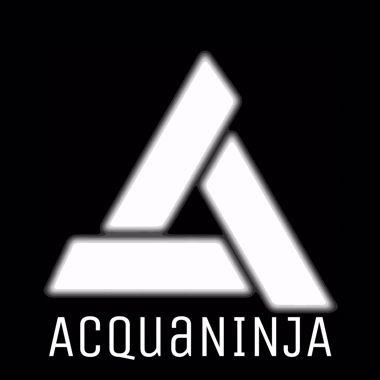
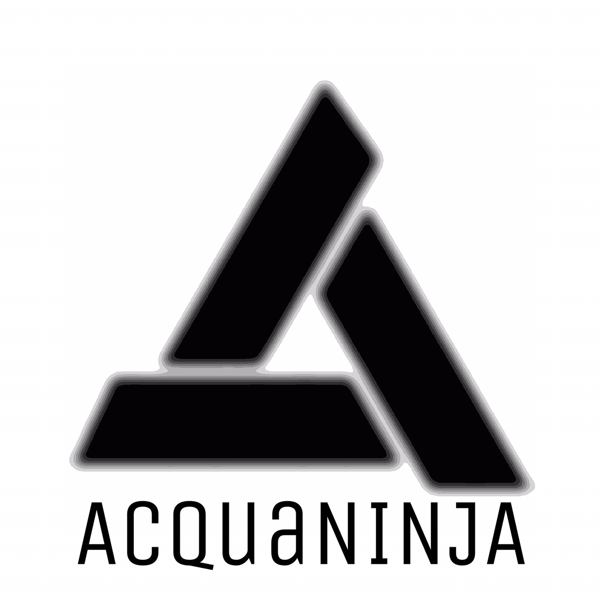
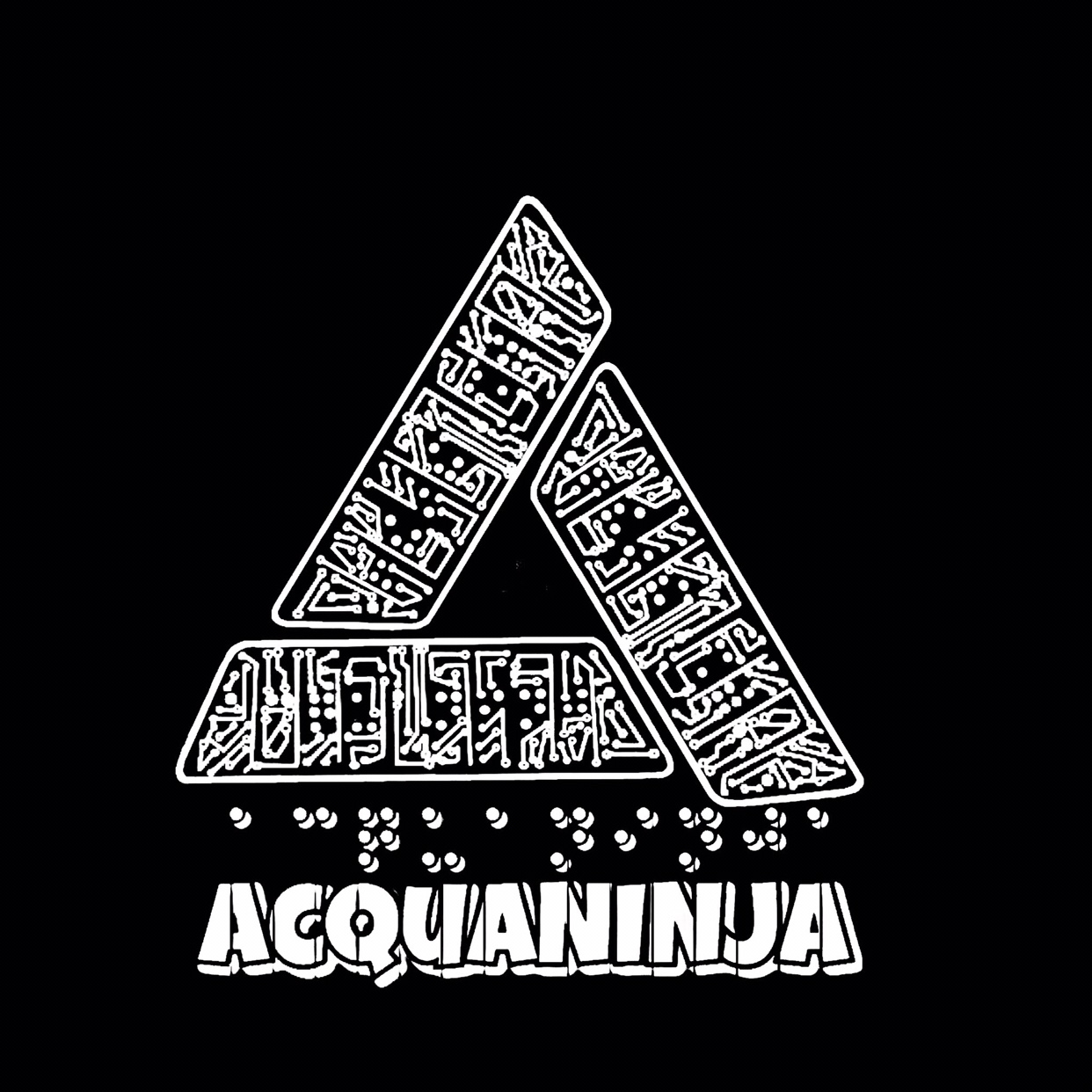
One of the final revisions performed as of Valentine’s Day 2018, this just added the high contrast, so we can use the logo in a wide range of areas.

The alluring @babydollbbw rocking our new logo on her tank top (shown below).
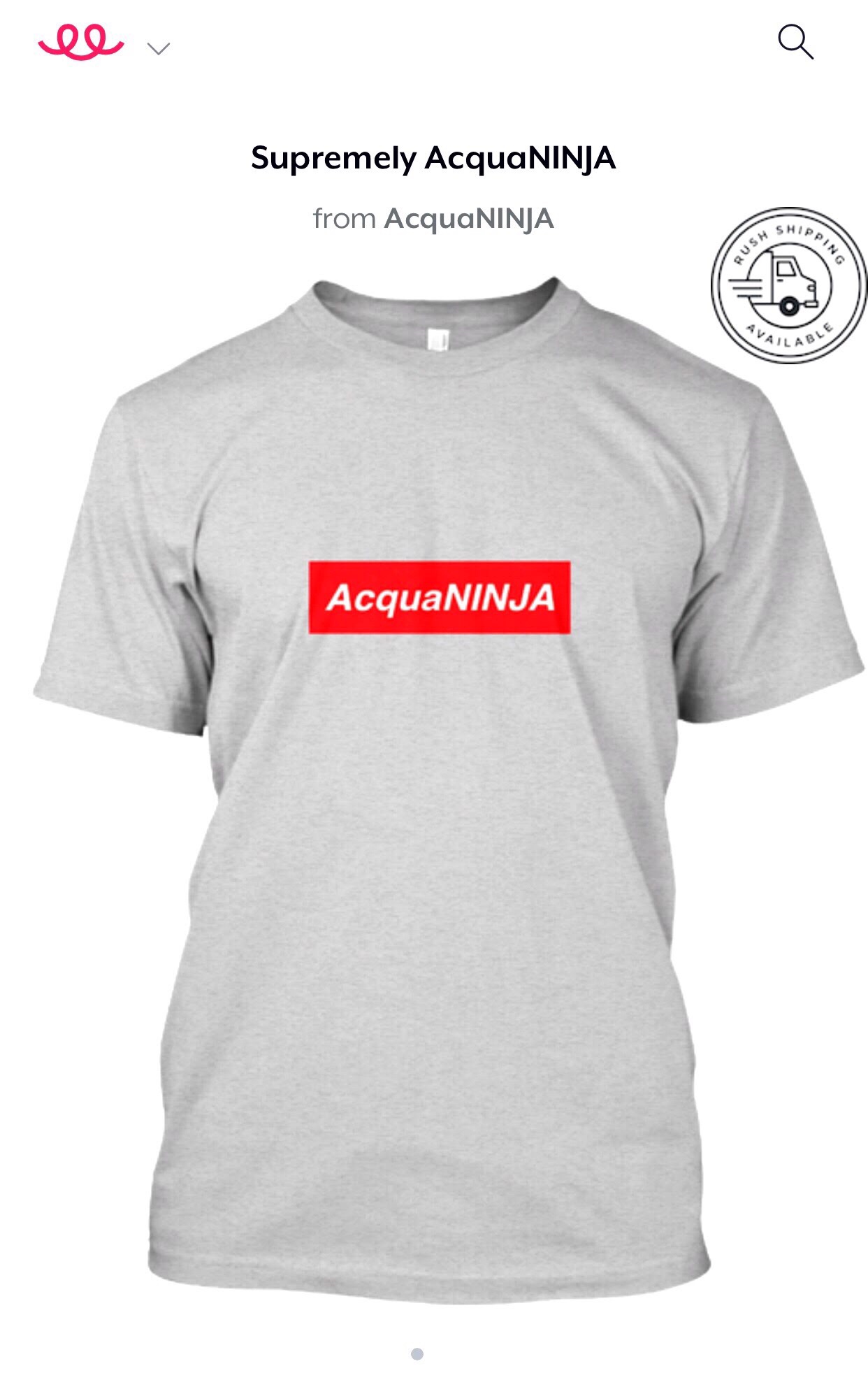
We even adapted the Supreme design language into our design (shown below).
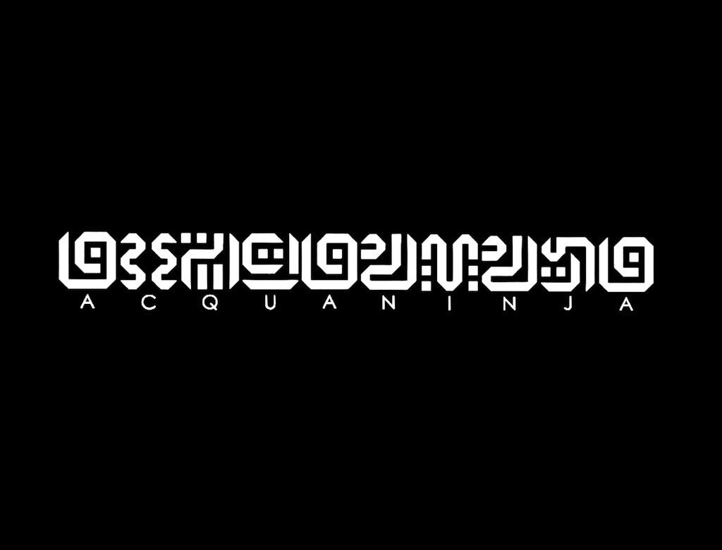
We had two polls on Twitter to decide which logo looked more aesthetic and people chose the black & white version and the company name integrated with the logo rather than below it. The results are below.
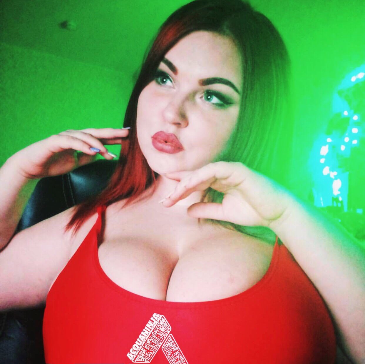
2020
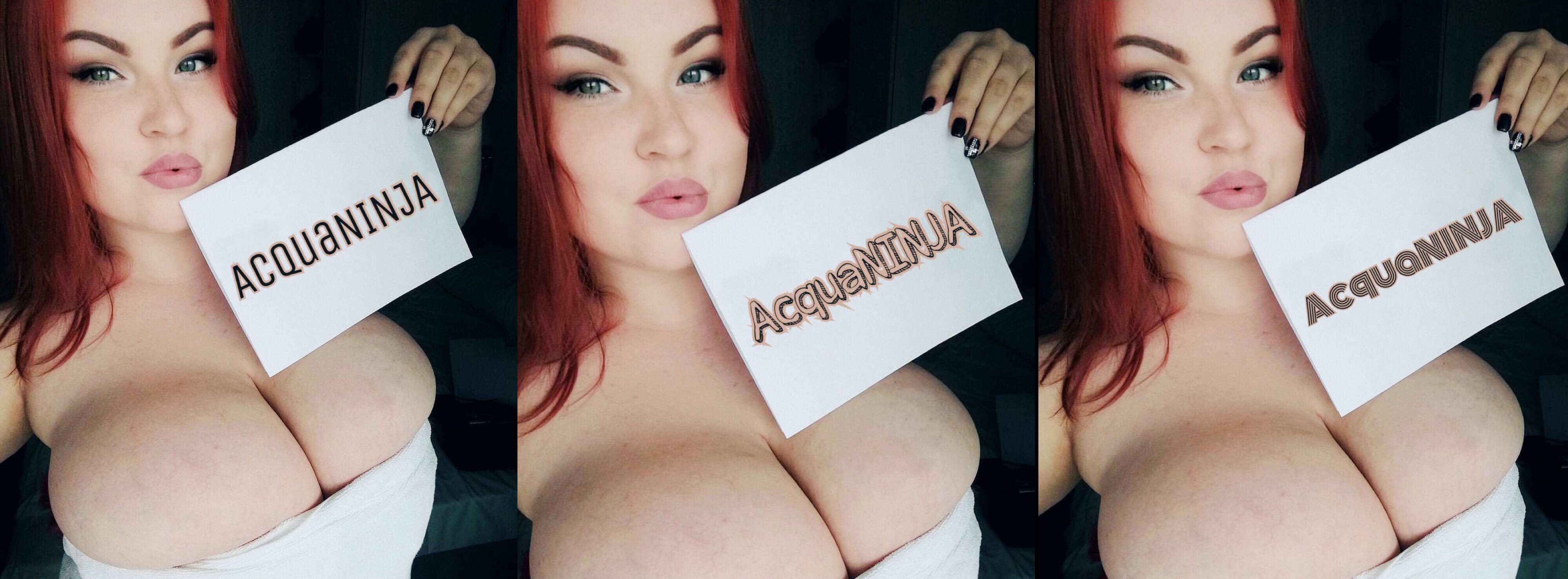
The voluptuous Alena Ostanova sporting the new logo in a red top (shown below)
This more bold logo is currently used for advertising and promotion from us, yet there are four other version in the array just for occasions (shown below).

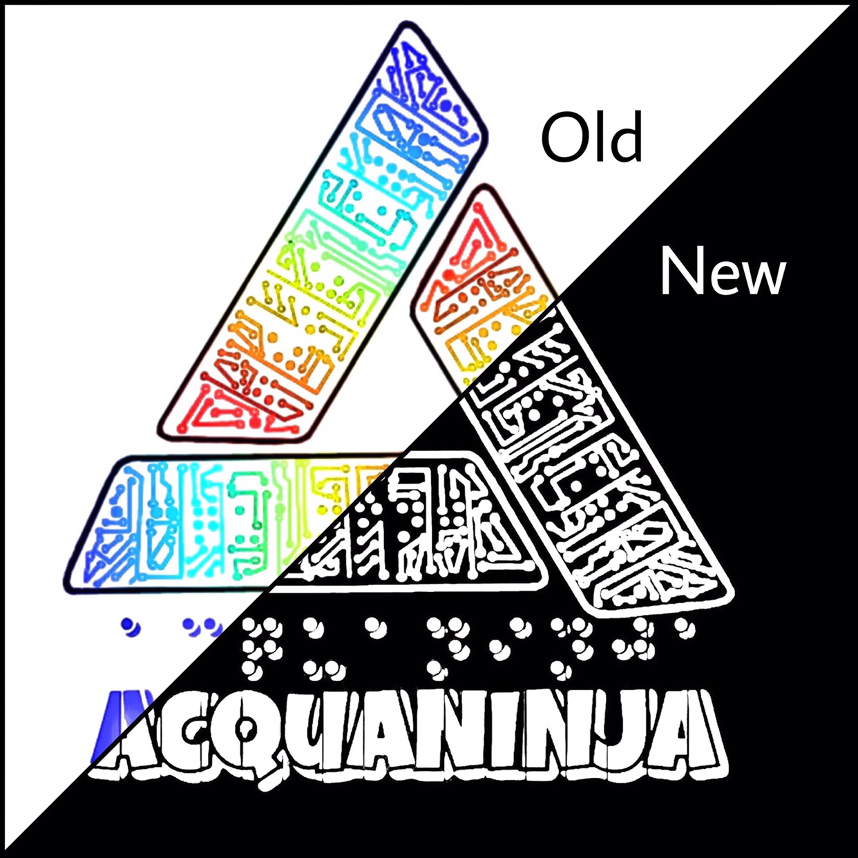
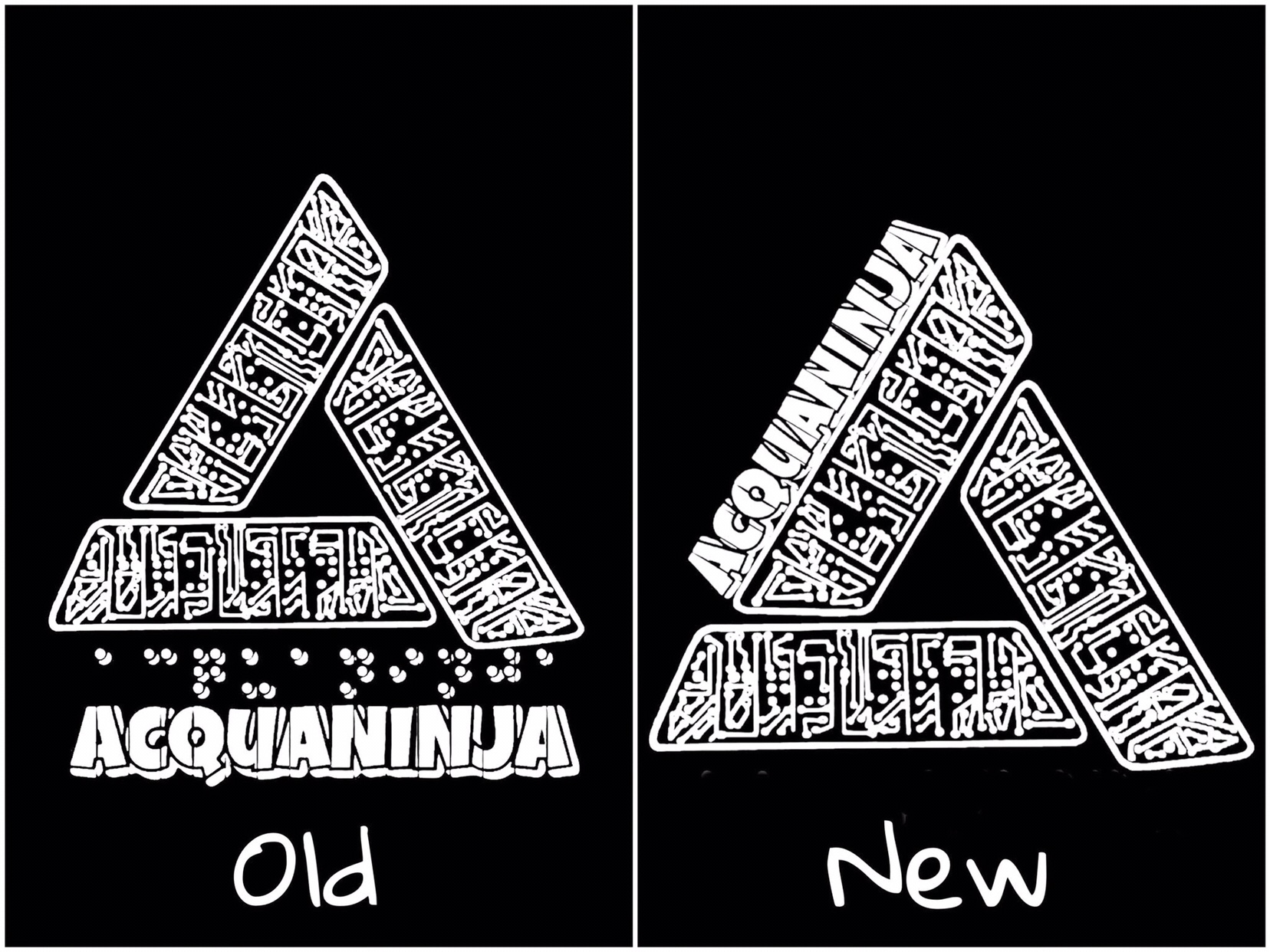
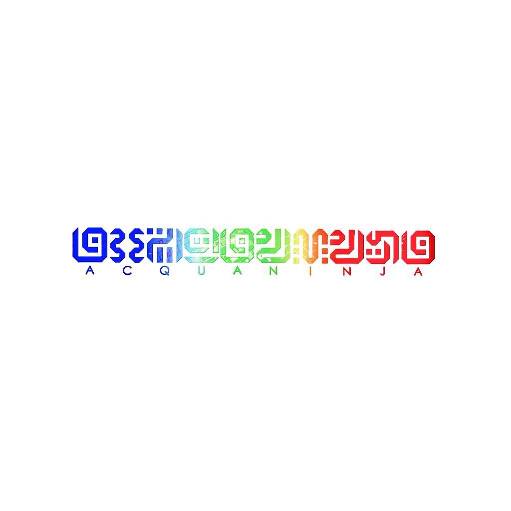
2022-2025
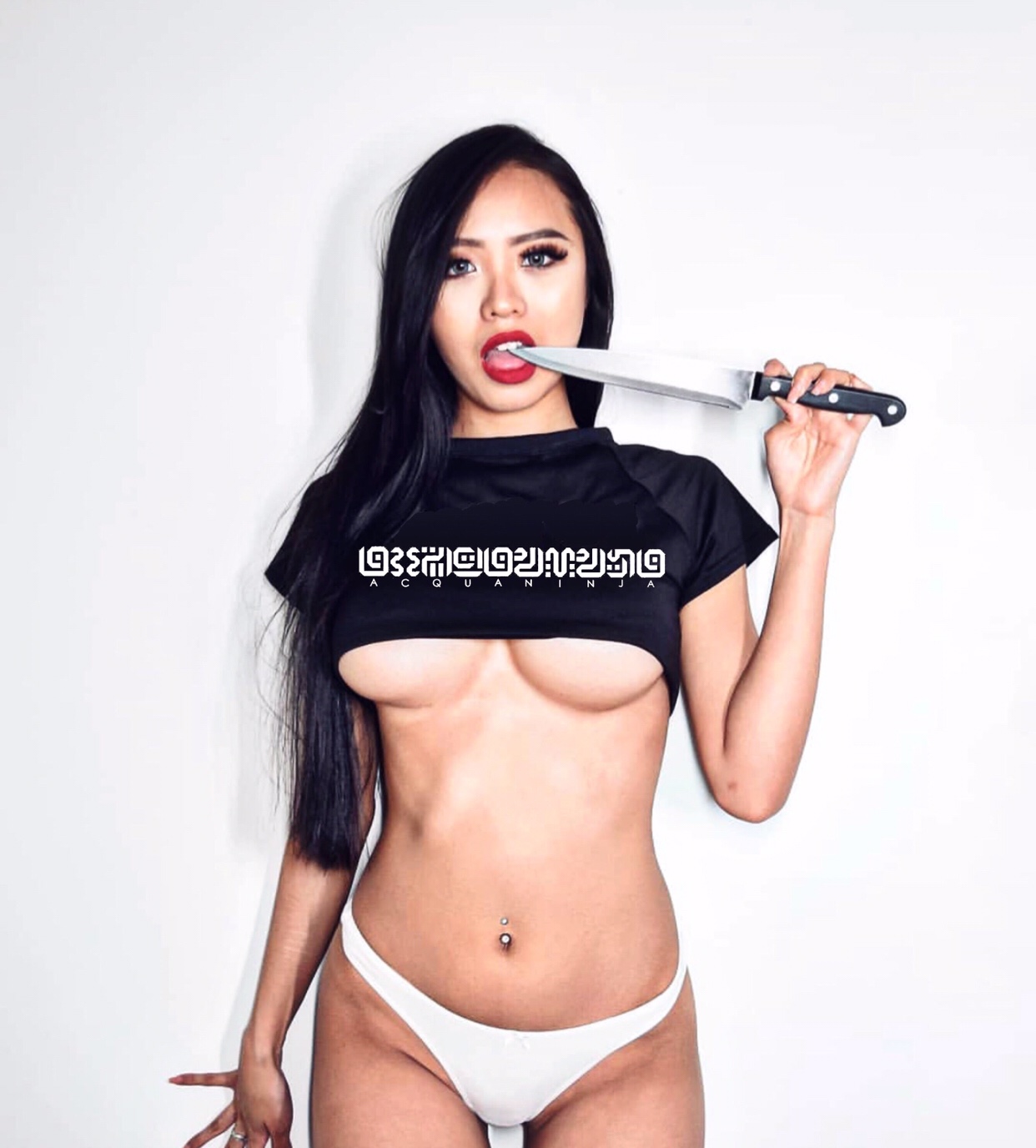
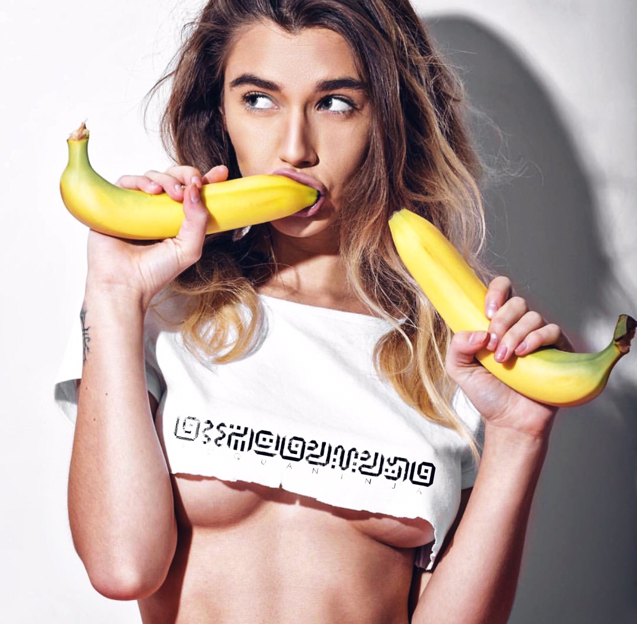
For our fashion we have updated our logo into an ancient design that is streamlined and and polished (examples can be shown below)
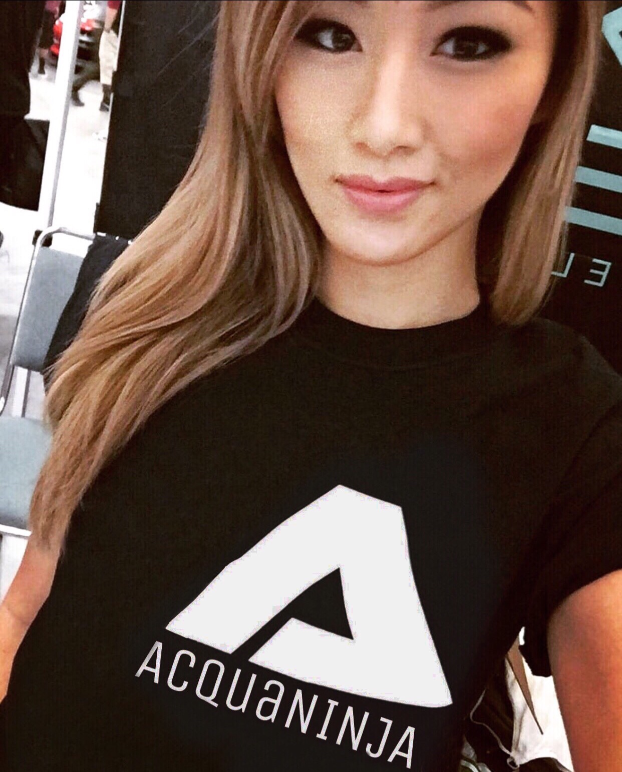
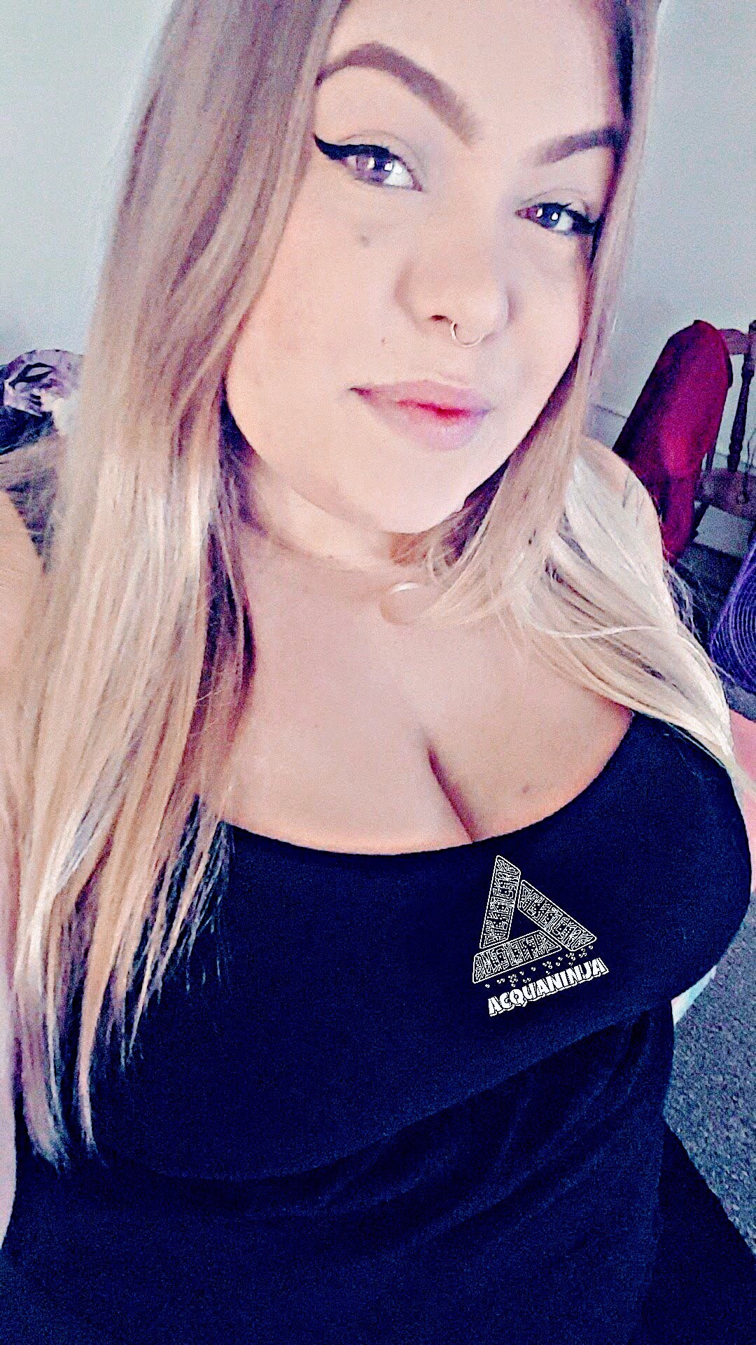
 A few of our models have been wearing the updated logo in our apparel which can be found in our store
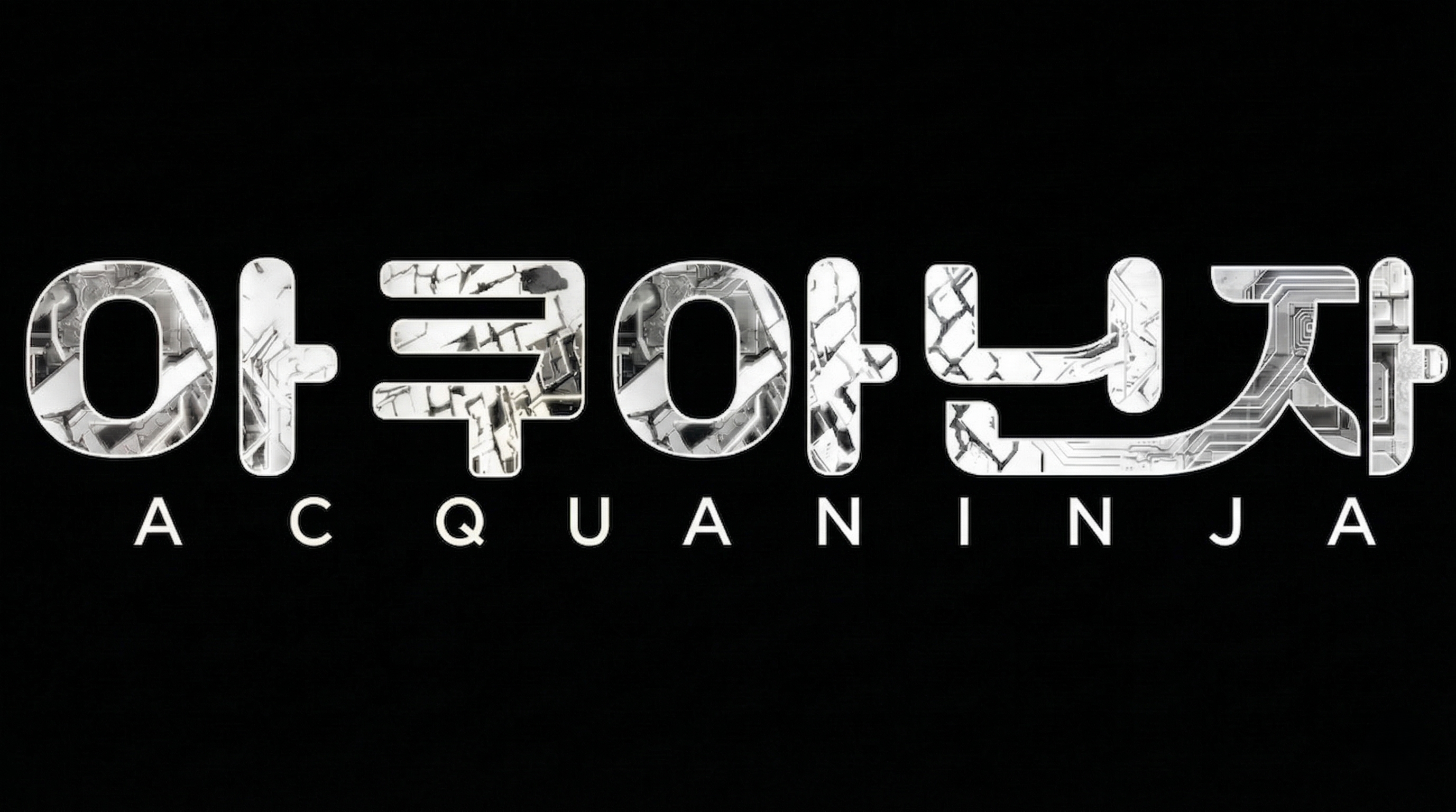
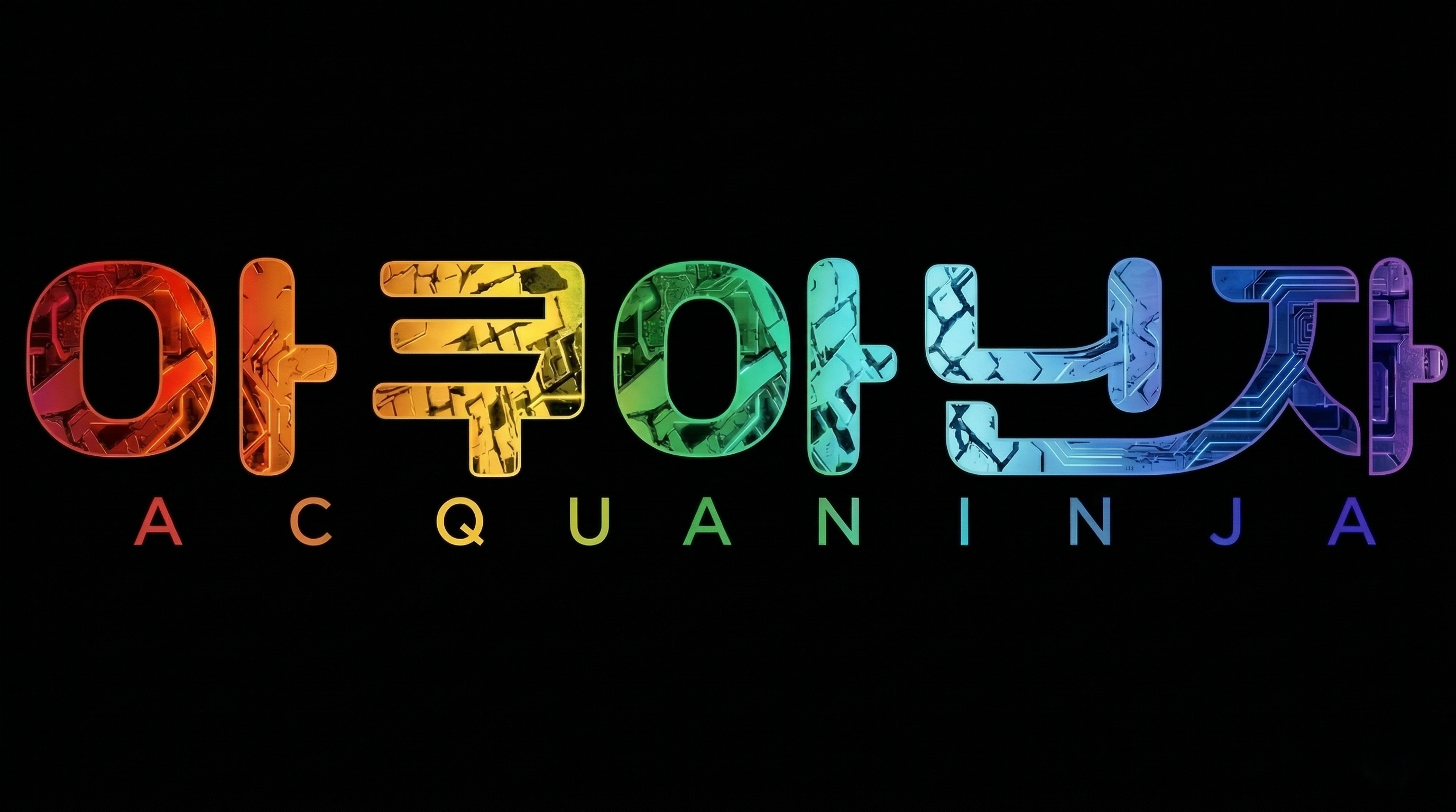
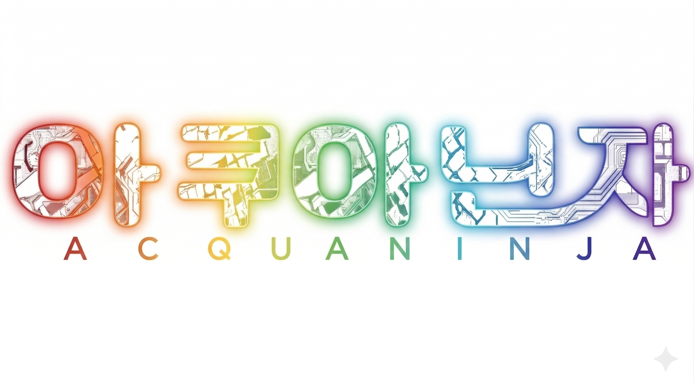
2026 – Present
Our new logo incorporates korean hangul instead of the ancient text which gives it a modern and refreshing look. Here are all the colorways now available for purchase in our store
This is the history of the AcquaNINJA logo from its creation to present day, if you want to design any artwork (including nail designs, car designs, prints, et cetera) simply email us at AcquaNINJA@outlook.com or send a DM to Khi Turner on Instagram
